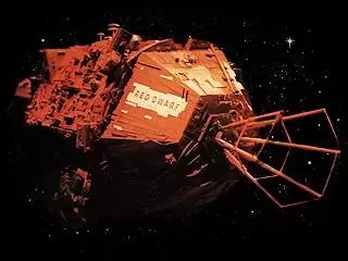
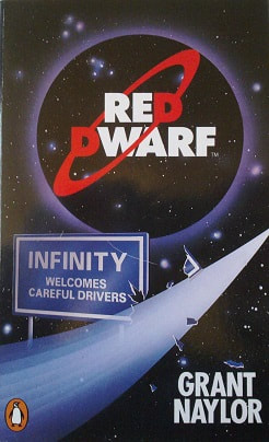
I chose to do a knockoff of the show Red Dwarf, created by Rob Grant and Doug Naylor for the BBC.
The premise is, a human being is put into stasis as punishment for sneaking a cat aboard a deep space mining ship, Red Dwarf. While he is contained there is a radiation leak which wipes out the rest of the crew. He is kept in stasis by the ships AI for 3 million years. The series follows his sci-fi adventures as the last human being alive.
It has 4 main characters (5 if you include the ships AI, Holly) which are;
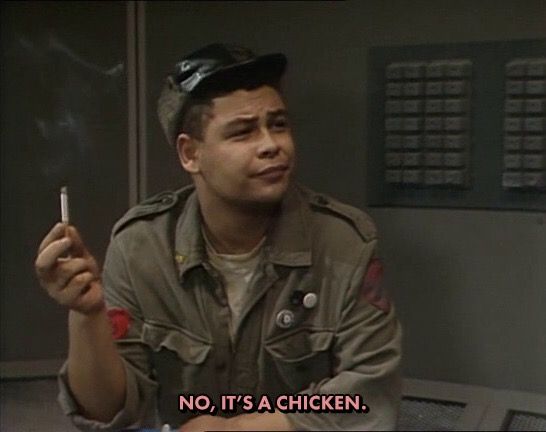
- Dave Lister, the last human (Space Bum) played by Craig Charles
- Arnold Judas Rimmer, who was a crew member Lister hated, brought back as a hologram by Holly to preserve Lister's sanity (Smeghead) played by Chris Barrie
- Kryten, who is an android built for sanitation who breaks his programming and joins Red Dwarf after being salvaged (Bog-Bot) played originally by David Ross, but is recast with Robert Llewellyn after season 2
- Cat, who is a life form that evolved from the cat Lister snuck aboard 3 million years ago (The Feline) played by Danny John-Jules
- Holly, the ships AI who is senile and played by both Norman Lovett and Hattie Hayridge.
|
|
|
|
It was a turbulent journey to getting my final product. Am I totally happy with them? No. Did I reach a point where I had to recognise my limits? Absolutely. It may not look like I've achieved much just based on 4 fairly simple enamel pin designs, but I've spent hours and hours working and learning and fighting Illustrator at every step.
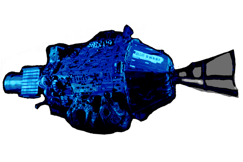
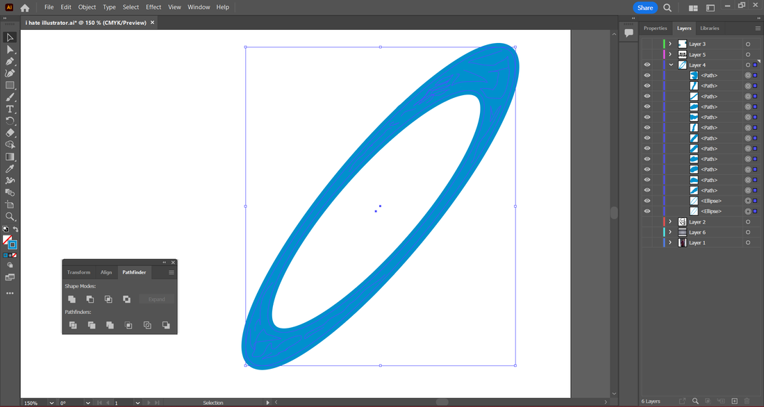
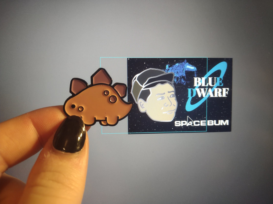
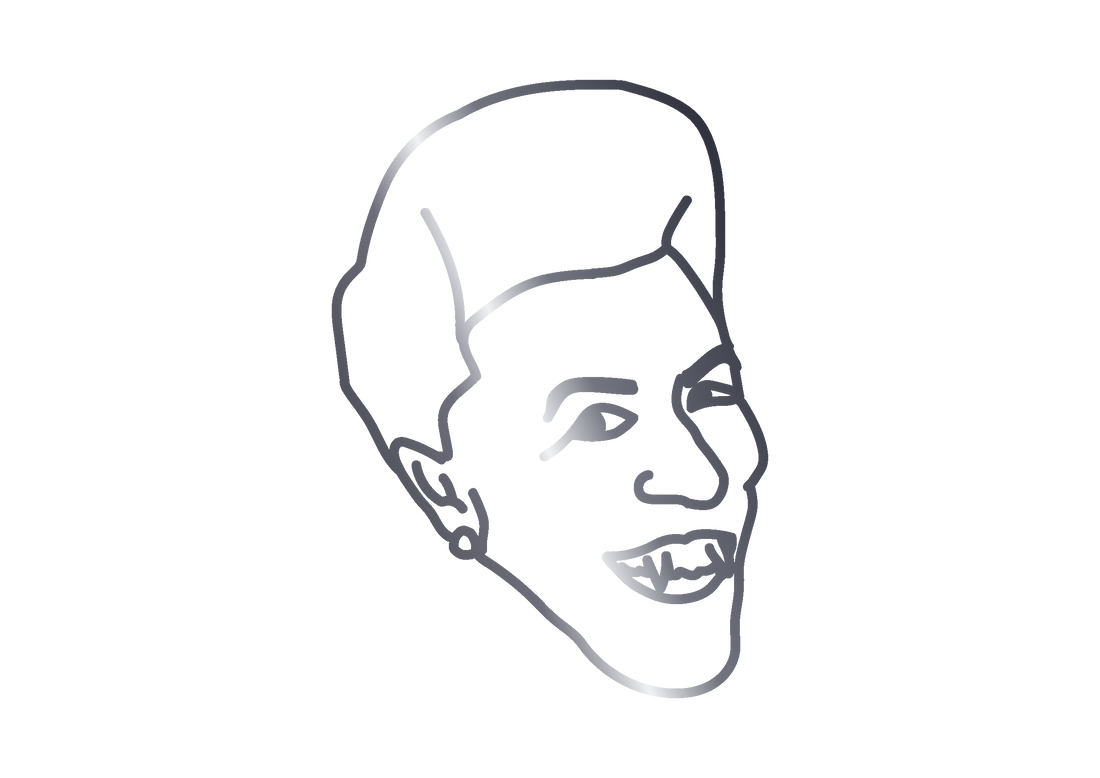
So, to explain the process in a simple way; I started with looking at existing merchandise so I could find and steal the exact typefaces they used. Through trial and error, I worked out that the main logo typeface was very similar to Abril Fatface, helpfully already existing in the Adobe font catalogue, and I quite liked that it was just slightly off from the original, having slightly thicker downstrokes and no rounded edge connecting the bottom serifs, and a slightly more fancy R, although an identical E. After hours scouring different font sites and a few "what font is this?" style pages, I found OPTI Edgar Bold-Extended, which is basically exactly spot on the font used in Red Dwarf promotional photos, and merchandise. I also noticed they often use a plain starry background with the ship in, and wanted to replicate that. I took an existing photo of the ship and played around with the colour values until I got it a nice shade of blue. I slightly shoddily (because I thought it would be barely noticeable but if spotted quite funny) wrote "Blue" over the original "Red Dwarf" I also cut around it carefully, and in between the thin lines of the Ram Scoop (the bit at the front) I used the eraser at half opacity to make the black lines less obvious, to allow some stars from the background to shine through. I did originally want to draw the "Blue Dwarf" from scratch, and decided to leave that as an optional extra to do at the end, but by the time I finished these pieces, even after working for hours on end each day, it was Tuesday night and I realised I still had to put everything on my website and bring together all the different files and bookmarked tabs I had to make it understandable. Next came the logo, this is where it got difficult. I spent over four hours alone on trying to make this. At a certain point I stopped counting for my sanity. The logo alone made me cry more times than anything else I tried to do. First of all, whenever I tried to fill the gap between the two inner and outer discs it wouldnt fill and got upset. I still have absolutely no idea why, every single post I found had the exact same instructions that I followed, and it just didn't want to fill. So I painted it in. This provided issues when it came to try and turn it into one solid object. Every time I tried it, it just deleted everything inside the larger ring. Then when it came to making the disc have gaps where the blue letters were the eraser kept removing text for some reason, and when I finally got it to only apply to only one layer it kept deleting whole chunks of line, it was a mess. But eventually I made it work by deleting 'too much' above and below the D and E, and then painting it back in with the paintbrush. Not the best way, but it worked, and it looks exactly how I wanted it. Next, the faces. I started with one, worked till I was happy, then did the other three in the same way to encourage repetition and therefore committing more of the steps to memory instead of doing it once and forgetting. It did get slightly easier each time. I started by sizing up my reference photo to the rest of the canvas, and used the paintbrush tool to draw out the shape of the face. I played around with line width and realised that while in fullscreen the image lines look really chunky, when actually at the size of a pin its spot on. (See the image of my dinosaur pin next to my screen with them sized similarly.) I turned the black lines into a shape when I was happy with them, I duplicated the object for later. I filled in the bottom layer with the desired colours, then took the copy of the outline and applied a slightly blued dark grey to light grey gradient over it, giving the appearance of a metallic sheen. I spent far too long playing around with the different colour layers in the gradient, the angle it was set to, and pissing about with it till it I was happy. I also tried multiple methods but this was the one I liked most and could replicate three more times without trying to punch my laptop. I came up with alternate names for the characters, Lister being a slobby human, Kryten being a toilet cleaning robot, Rimmer being a complete and total smeghead, and Cat being, well, a cat, I'm quite happy with the new names I decided on. I used the second typeface I had found to write the names at the bottom, wanting to keep the backing card as close to identical as possible across my designs. I moved around all my different objects till I was happy with the look, and then made the other three heads, constantly finding new ways to accidentally break Illustrator, and then trying to fix it. Eventually I had them all, made sure the heads were in the right places, and exported them. You'd assume the easiest part, but it kept absolutely destroying the quality, and after an hour I completely gave up, copied and pasted all the layers across to Krita (a free software I normally use) and saved them as PNGs from there, with no issues arising. Of course. |
|
Overall I feel I have a far better understanding of illustrator and I can now grasp what it is and isn't good at doing, but remain continually baffled and incredibly slow at navigating the site, I also struggle to troubleshoot unlike software I am better versed in, where if something isnt working I can find out why, for illustrator I have to google blindly and hope someone asked the same question on reddit 6 years ago.
I intend to keep working on getting better, to a point where I can work without googling every other button I press, but I doubt this will become a common piece of equipment I use. However this has spiked my interest into trying to learn Adobe Fresco, so thats something.
I also have lots of other ideas for pins I want to make, and have decided to add this task to the list of ongoing projects (like the sketchbook work) so hopefully you'll see more being added to this page as time goes on. As much as I hate Illustrator I refuse to let it beat me.
A comprehensive list of every article, blog post, adobe support page, and video I used to learn how to use illustrator.
Not every single thing I learned was applied to my pieces, but I at the very least gave each thing and go and tried to learn more, then decided if I wanted to use it, or if I felt it would cause more of a headache than a help.
I also asked the Adobe Illustrator subreddit for help at one point, they were lovely but we couldn't work out what was causing certain things to not work (the blue disc).
y-designs.com/ideas/tutorials/illustrator-tutorial-combining-multiple-shapes-into-one-pathfinder-tool/
www.webdew.com/blog/use-pathfinder-in-illustrator
community.adobe.com/t5/illustrator-discussions/pathfinder-not-working-for-what-i-need-please-help/m-p/10036638
graphicdesign.stackexchange.com/questions/41812/illustrator-how-to-fill-space-between-2-shapes
www.websitebuilderinsider.com/how-do-i-erase-part-of-an-image-in-illustrator/
haizdesign.com/adobe/convert-lines-to-shapes-in-illustrator/
smallbusiness.chron.com/join-lines-closed-object-illustrator-36217.html
graphicdesign.stackexchange.com/questions/112837/how-to-combine-lines-into-a-shape
helpx.adobe.com/uk/illustrator/using/creating-shapes-shape-builder-tool.html
graphicdesign.stackexchange.com/questions/115089/adobe-illustrator-cant-fill-shapes-with-color
logosbynick.com/flatten-an-image-in-illustrator/
www.wikihow.com/Rasterize-in-Illustrator
www.wikihow.com/Make-Adobe-Illustrator-Background-Transparent
www.wikihow.com/Create-an-Outline-in-Adobe-Illustrator
www.wikihow.com/Create-Vectors-in-Adobe-Illustrator
www.wikihow.com/Add-Pages-in-Adobe-Illustrator
www.wikihow.com/Remove-an-Effect-in-Adobe-Illustrator
www.adobepress.com/articles/article.asp?p=2350705&seqNum=3
www.websitebuilderinsider.com/how-do-you-do-a-metallic-effect-in-illustrator
community.adobe.com/t5/illustrator-discussions/importing-png-with-transparent-background-into-illustrator-cs6/td-p/8522243
www.adobe.com/uk/products/type/install-instructions.html
community.adobe.com/t5/illustrator-discussions/how-to-save-high-quality-images-jpegs-pngs-from-illustrator/td-p/11377779