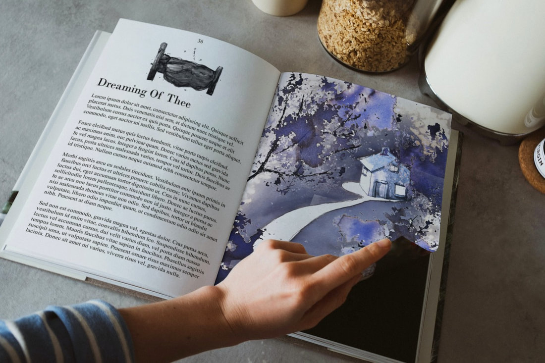
Dreaming of thee
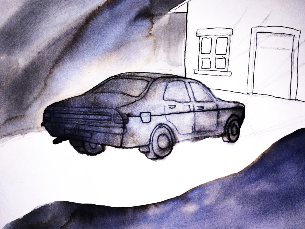
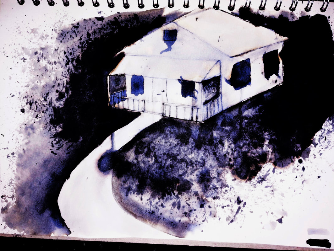
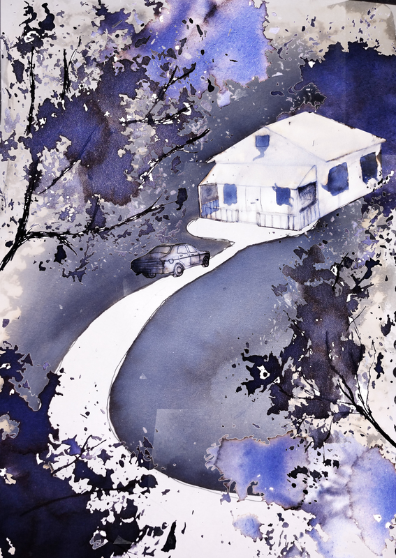
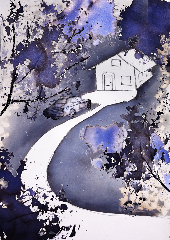
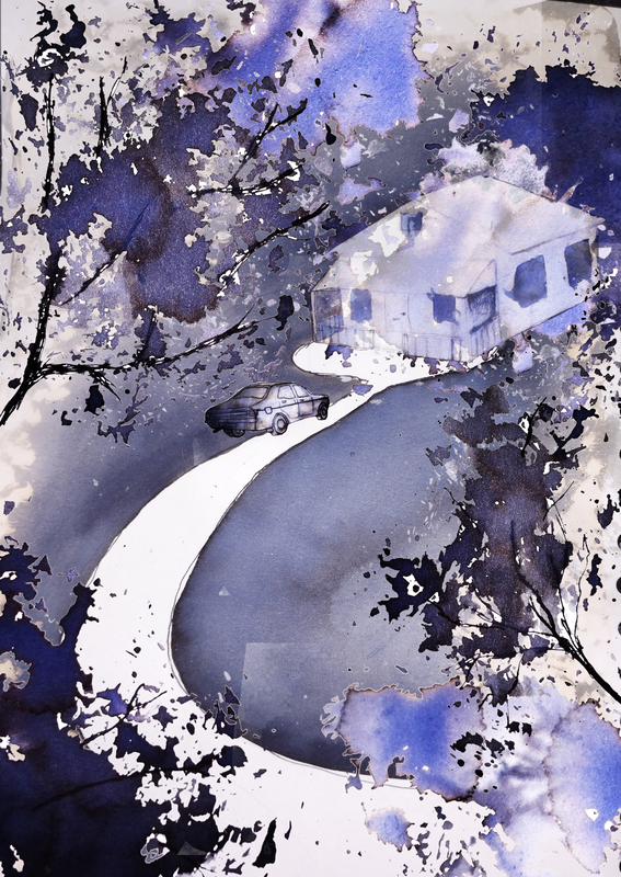
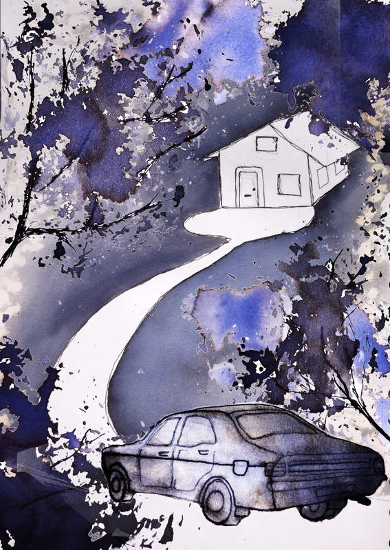
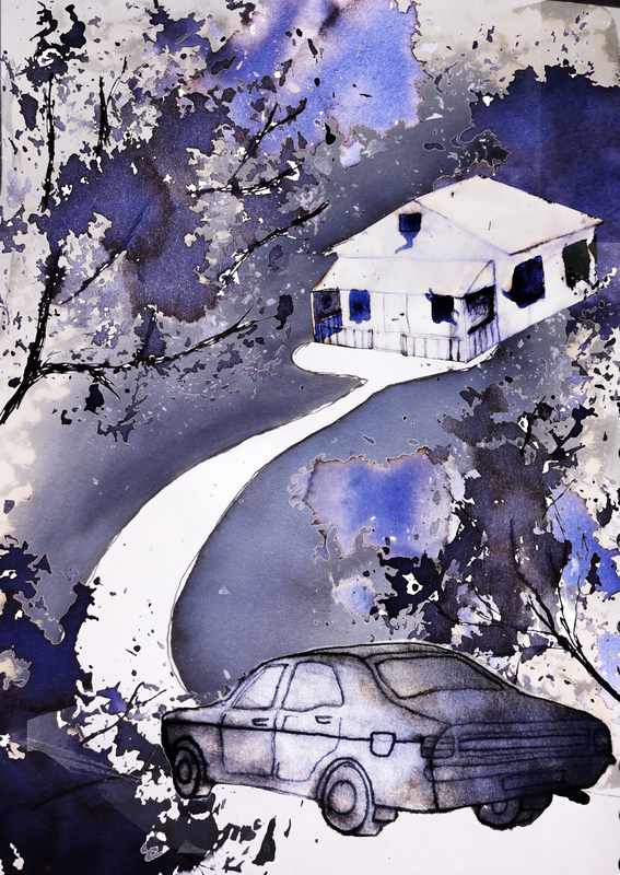
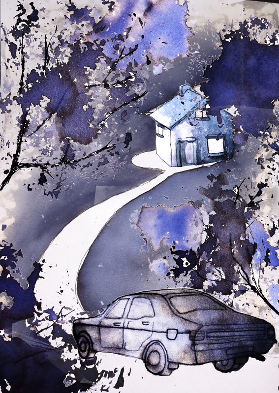
Story recap: a woman keeps having nightmares where shes trying to enter a house at night. Shes convinced theres someone in the house. In real life, on a drive to her friends house with her sister, she runs into the house, not knowing it was real she is curious, gets out, goes to knock on the door, a man answers it and she passes out. Sister takes her to their friends house.
Later, sister goes to knock on the door of the house again, to explain to the owner what happened, and he explains he too was having nightmares about a person desperately trying to get into his home, and he was trying to hide from them.
Later, sister goes to knock on the door of the house again, to explain to the owner what happened, and he explains he too was having nightmares about a person desperately trying to get into his home, and he was trying to hide from them.
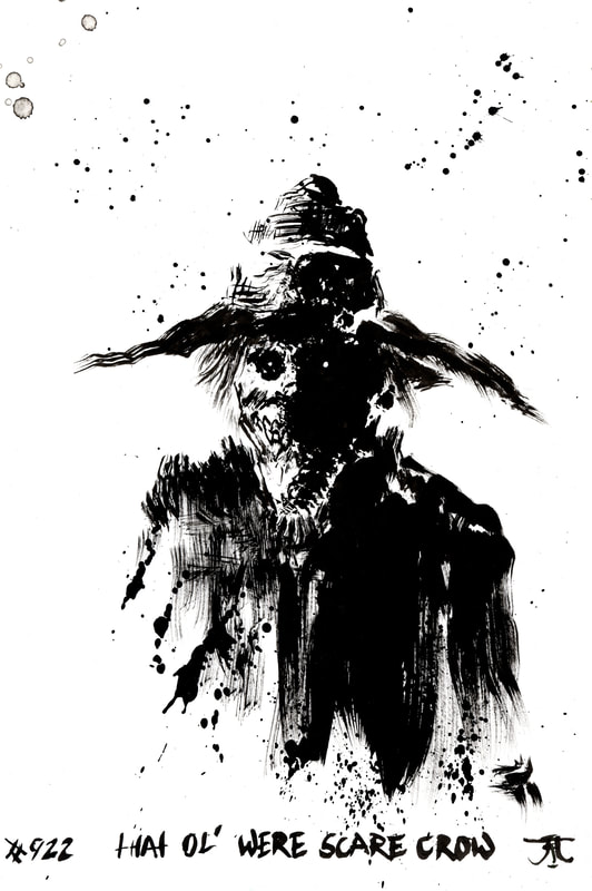
FUll page illustration: which style?
Kim diaz holm (ink) |
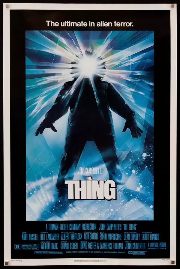
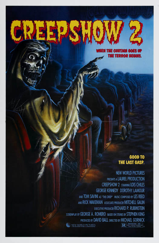
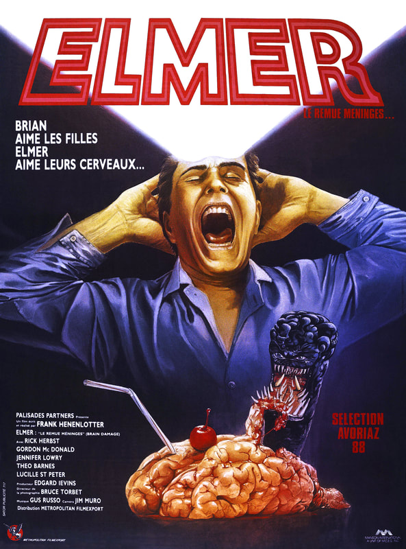
painfully 80s movie posters |
|
|
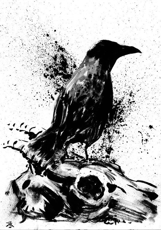
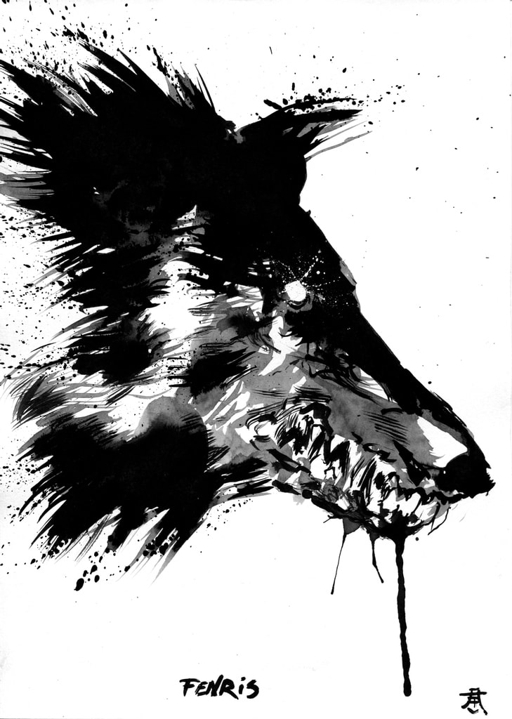
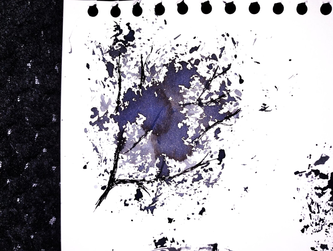
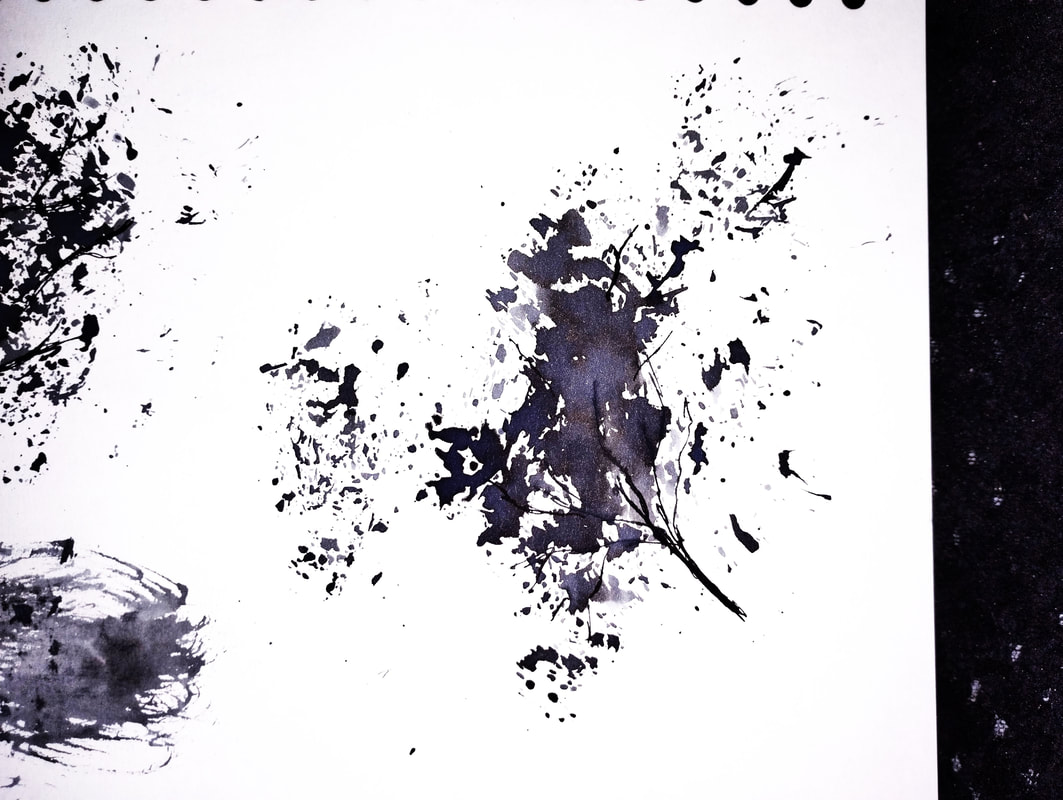
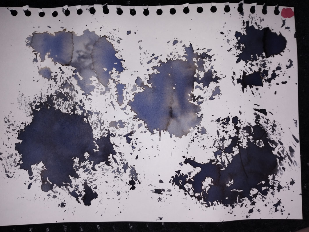
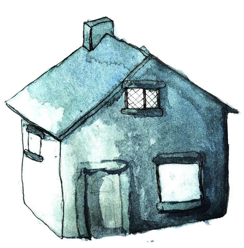
painting with ink and bleach
Fun fact! When bleach and rubbing alcohol mix, it creates chloroform, which I definitely did not accidentally create and then spend 3 hours sat outside my flat in the rain waiting for it to air out. I'd for sure never have done that. Ever. Yea...
|

|
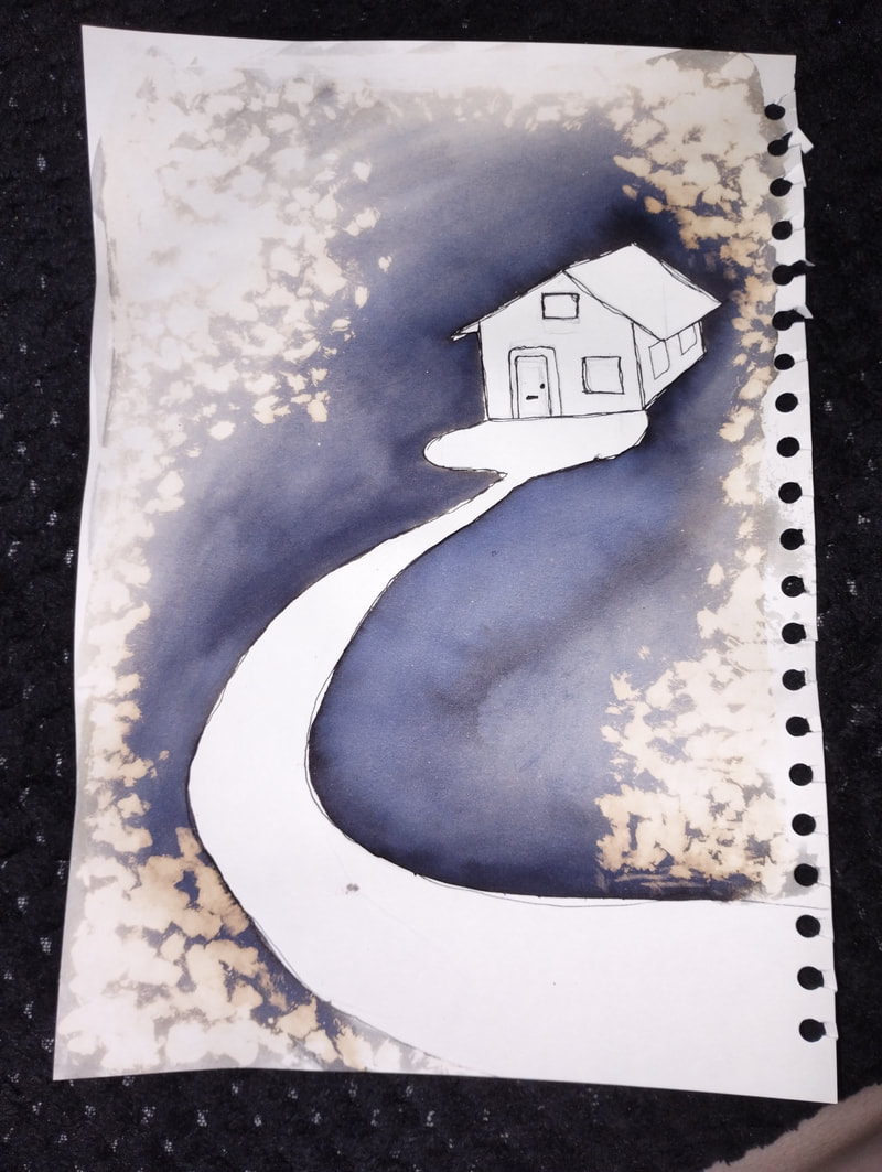
Digital collage time
|
|
|
Typography
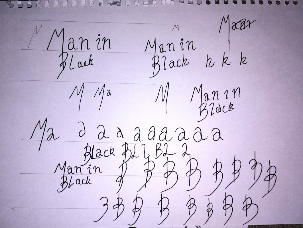
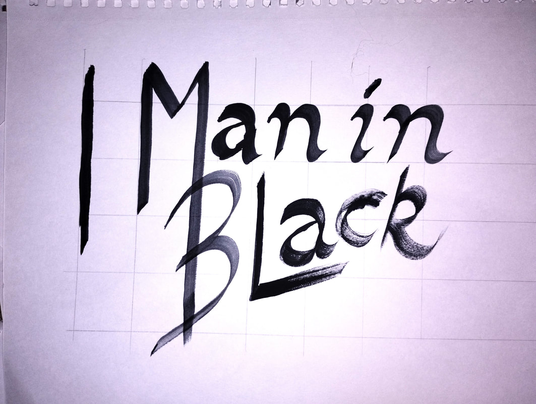
Please hold a moment of silence for the hours I spent trying to hand render this before realising it wouldn't even fit the style I was doing for the cover :')
It was pretty much just pages and pages of this:
It was pretty much just pages and pages of this:
|
|
|
|
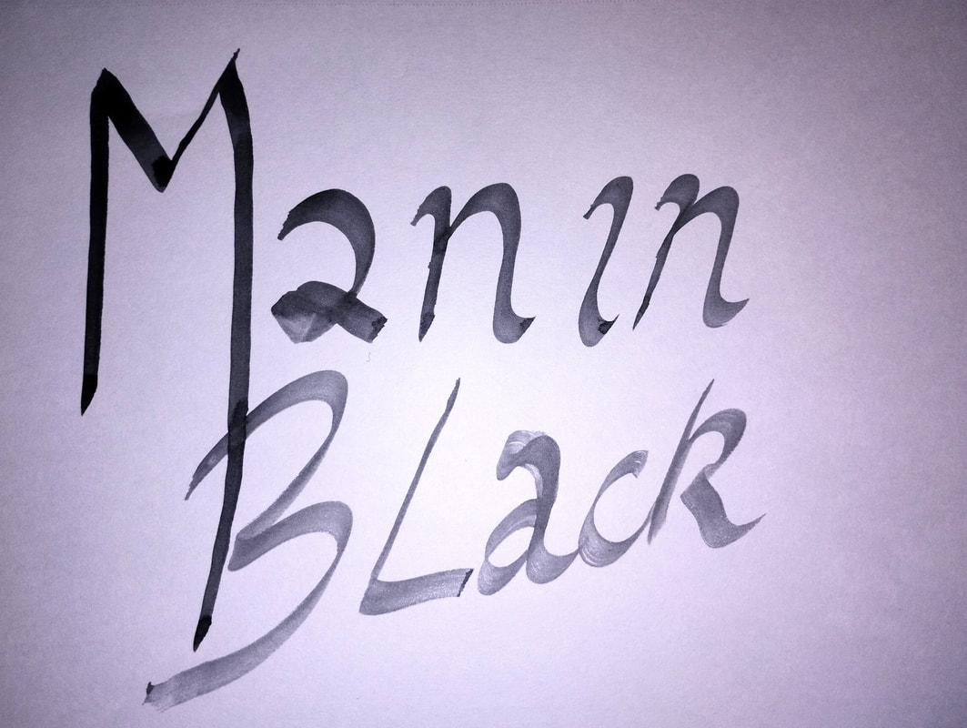
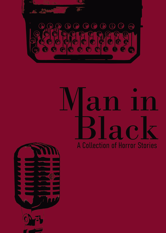
I ended up making it digitally, using Bodoni MT. I turned the vector layer into a paint layer, and cut up parts of the M to attach them to the B to give a flow between the two. I managed to line up the rest of the type with this very carefully so that it all sat nicely together.
I am very proud of this typography, it came out exactly as I had imagined it. |

|
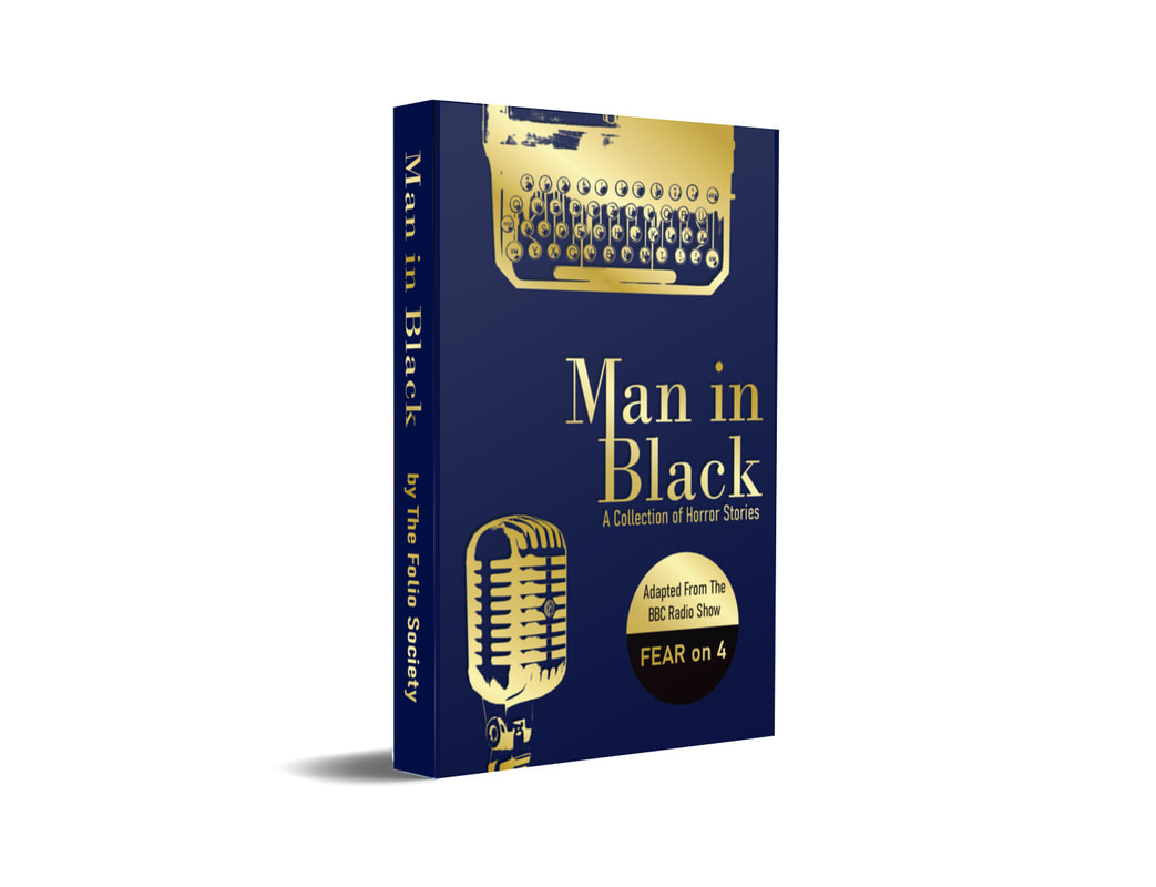
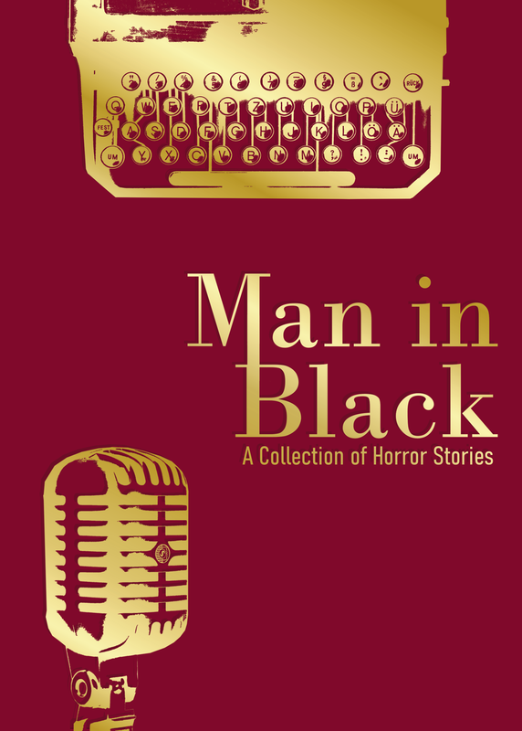
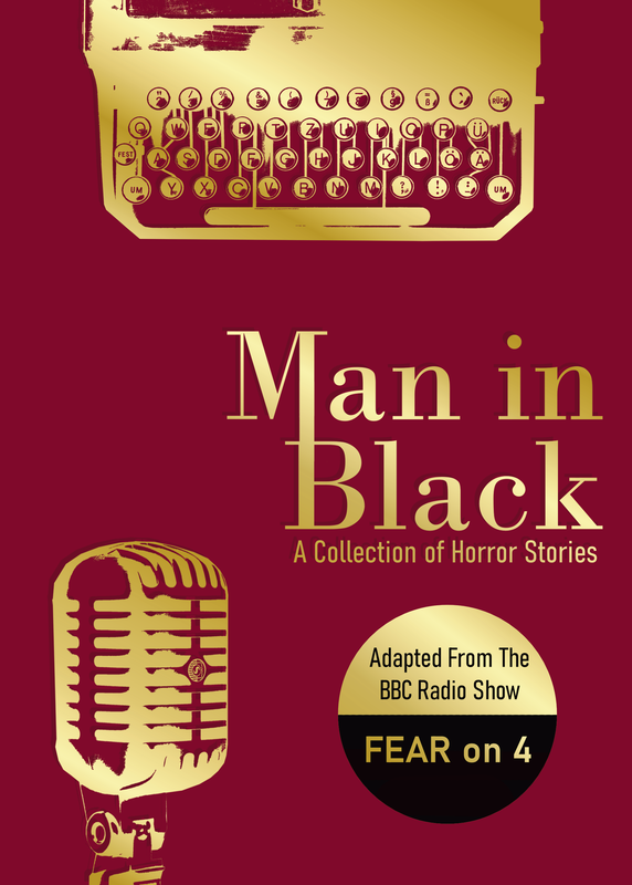
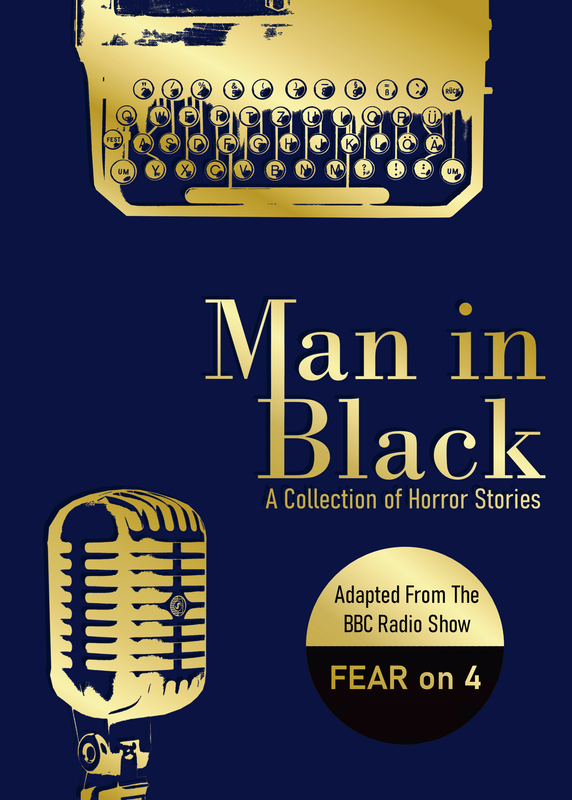
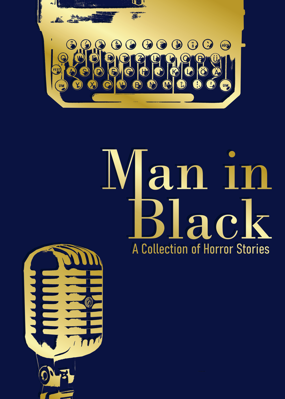
front cover and spine
Fabric hardback book, embossed with metallic foil. Don't want to front only one story, drawing "the man in black" is too easy, make it intriguing with an homage to it being stories all the way back to the 50s, and to it being a radio show.
Would the book look at home on the middle shelf in a musty office of a middle class granddad whos house feels like a creepy museum that cost him 15k and a bag of beans back in the 70s? (aka my grandparents)
Would the book look at home on the middle shelf in a musty office of a middle class granddad whos house feels like a creepy museum that cost him 15k and a bag of beans back in the 70s? (aka my grandparents)


|
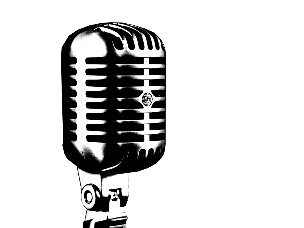
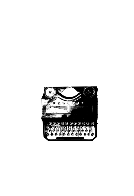
Turning photos into flat one colour images:
1) image from unsplash 2) desaturate 3) mess with the levels till its completely black and white 4) use a green layer underneath so you can see where the white is 5) delete the white parts Bish bash bosh, sorted. 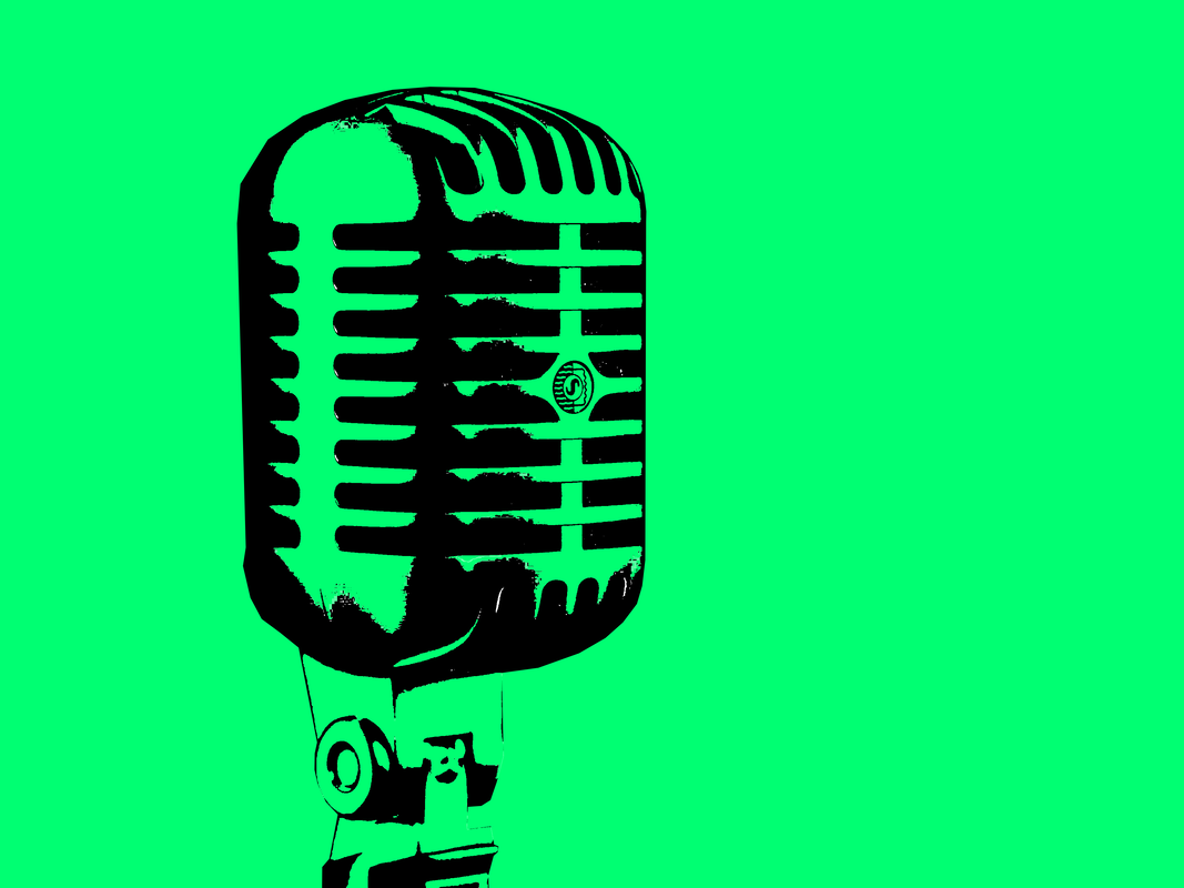
|

|

|
|
|
|
|
|
In case its not clear: the disc is a foil sticker on the top of the cover. The rest of the gold is debossed onto the cover, I know I could have used three colours on the cover itself, but I liked the idea of just the base colour on the textured hardback surface, with gold foil on it, and used black for the sticker so it was readable.
Final Images