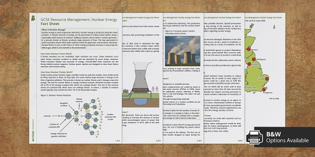
Research
|
|
|
|
|
|
|
|
|
|
|
|
deciding my specifications and thumbnailing
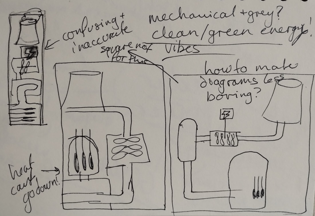
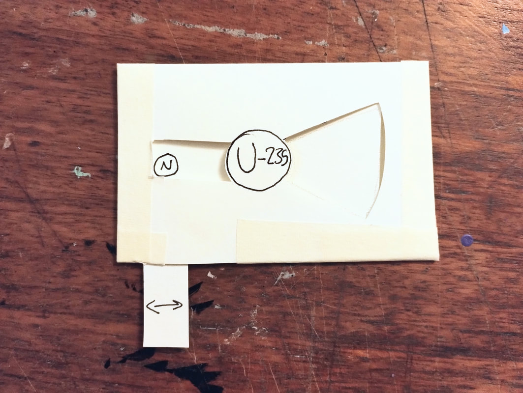
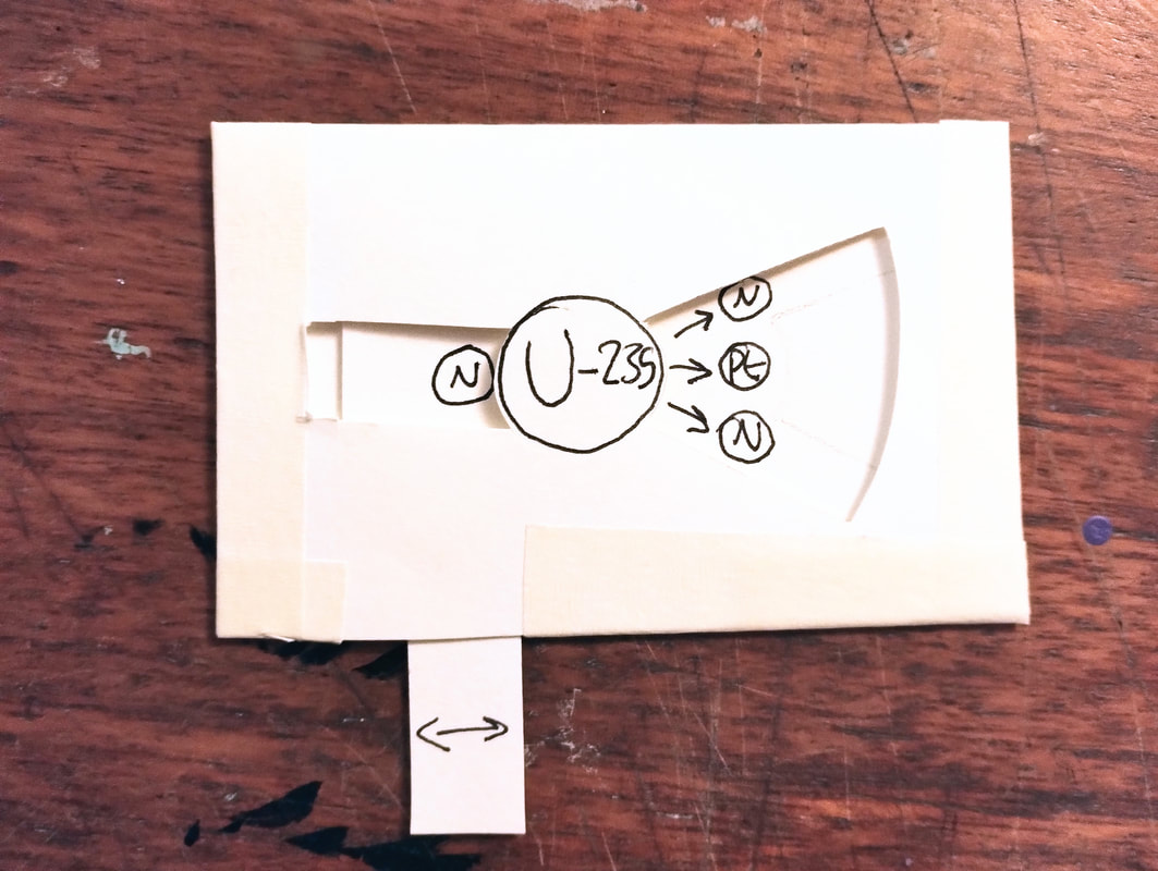
I considered many different methods (mostly little booklets or pop ups) but found it restricting as it pushed my audience a little too young, I did begin thumbnailing for a few of them, but couldn't get the idea of a big poster on a science room wall, the type that used to catch my attention as a kid, and honestly even now, out of my head.
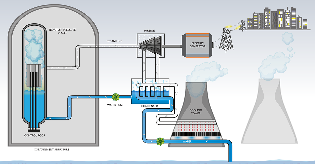
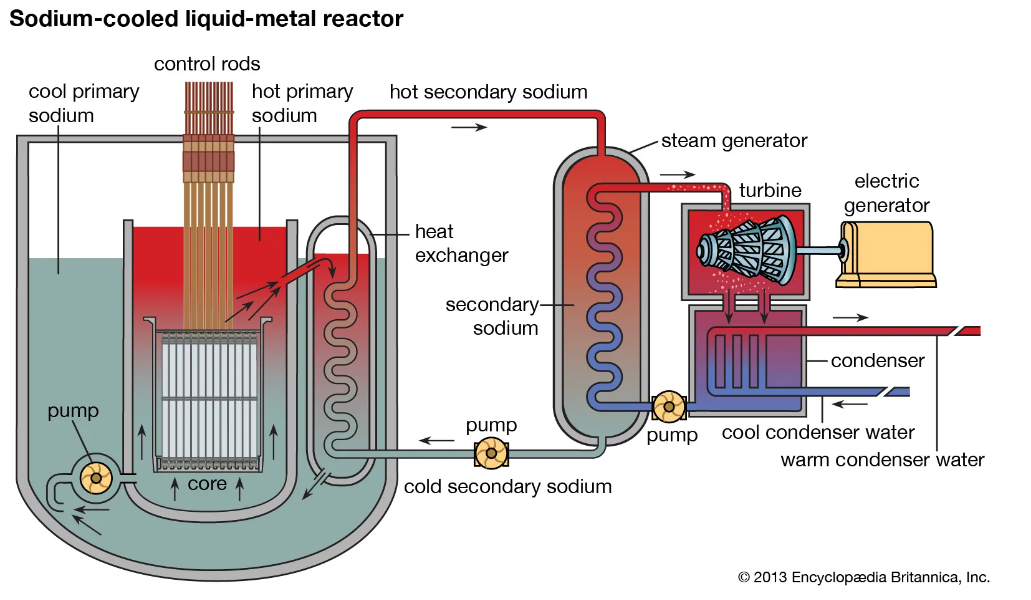
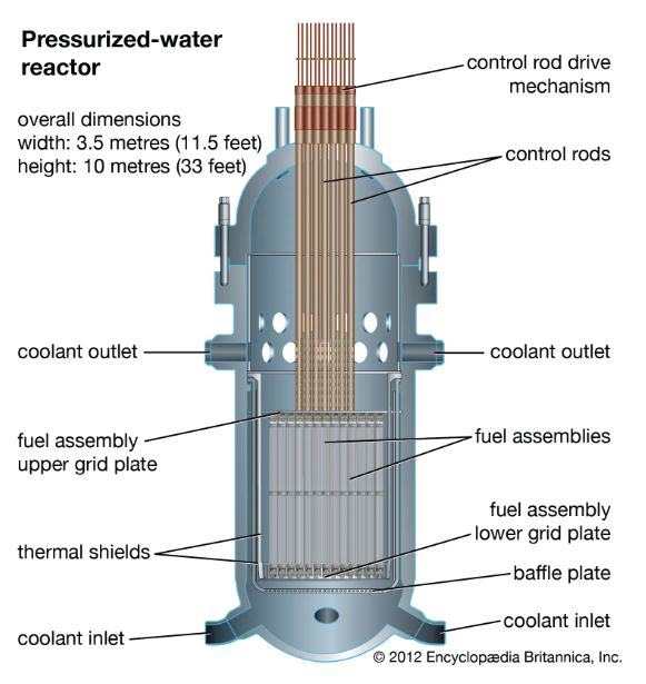
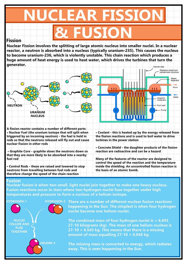
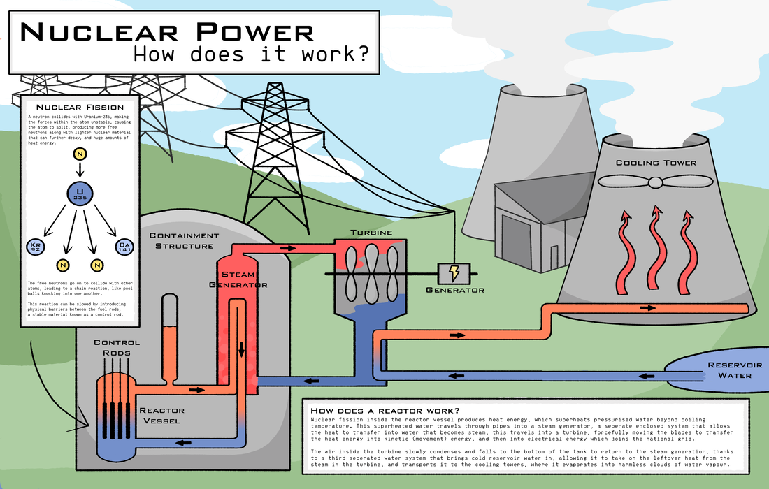
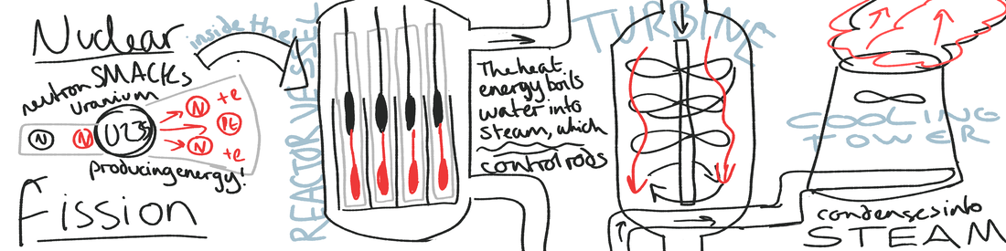
And so I have chosen to do a poster, improving on the really ugly diagrams that are in physics textbooks, making them slightly more visually appealing. My target audience is GCSE students, I want it to be eyecatching, something a bored kid can look at and learn something from.
And so I have chosen to do a poster, improving on the really ugly diagrams that are in physics textbooks, making them slightly more visually appealing. My target audience is GCSE students, I want it to be eyecatching, something a bored kid can look at and learn something from.
|
|
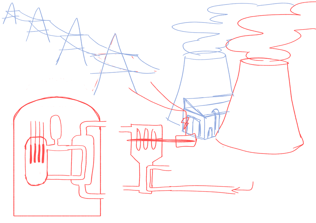
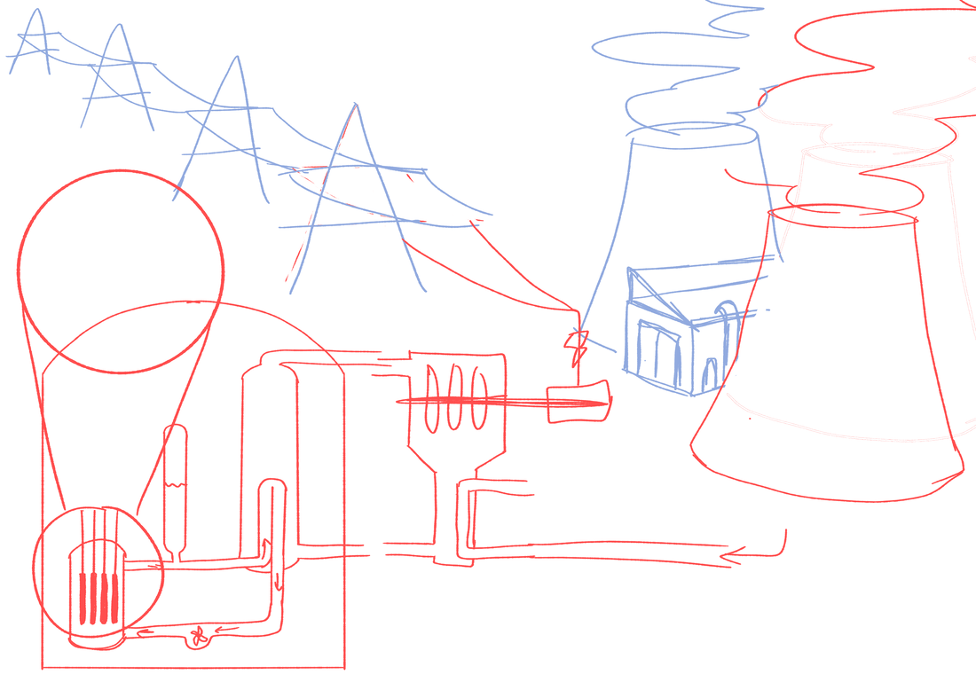
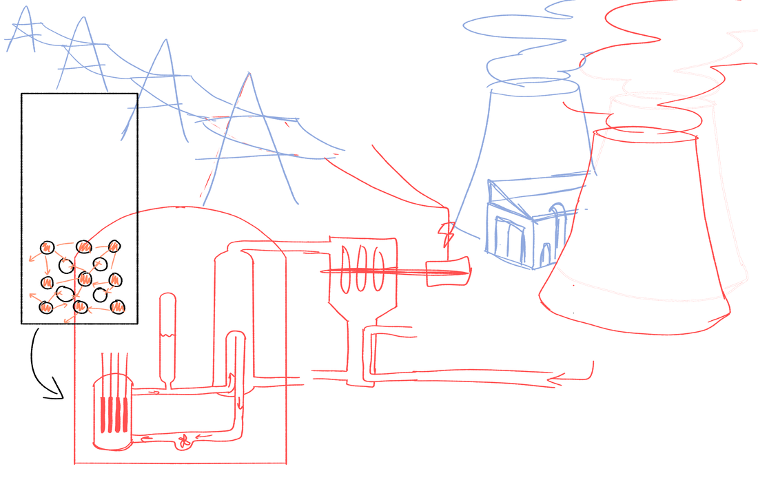
Developing the poster idea
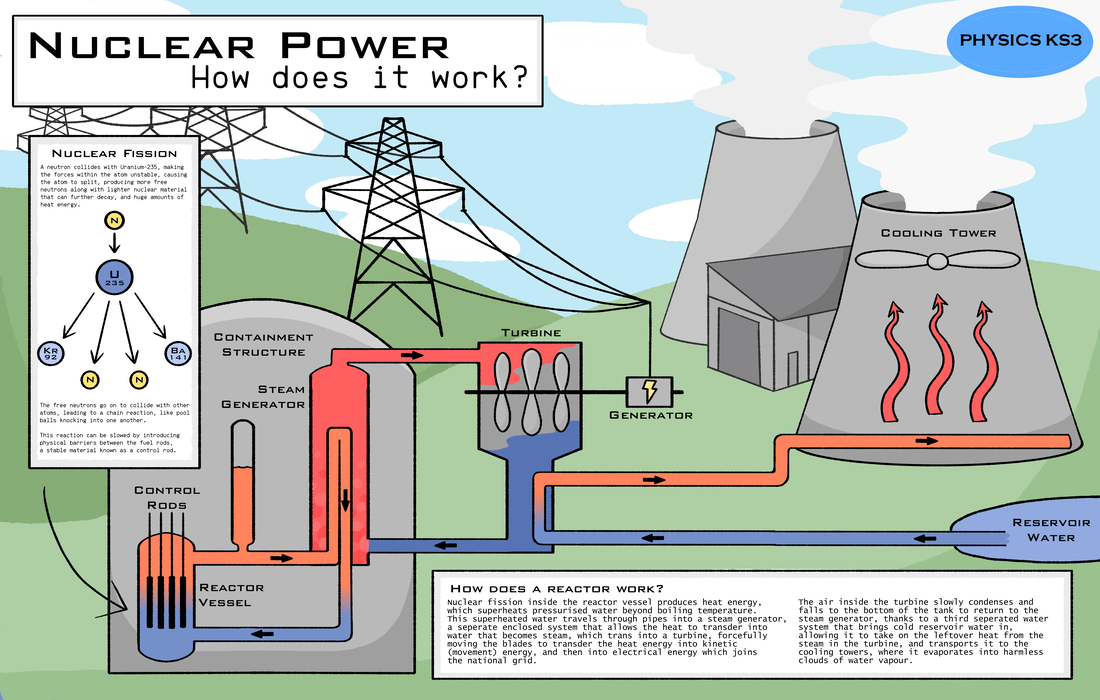
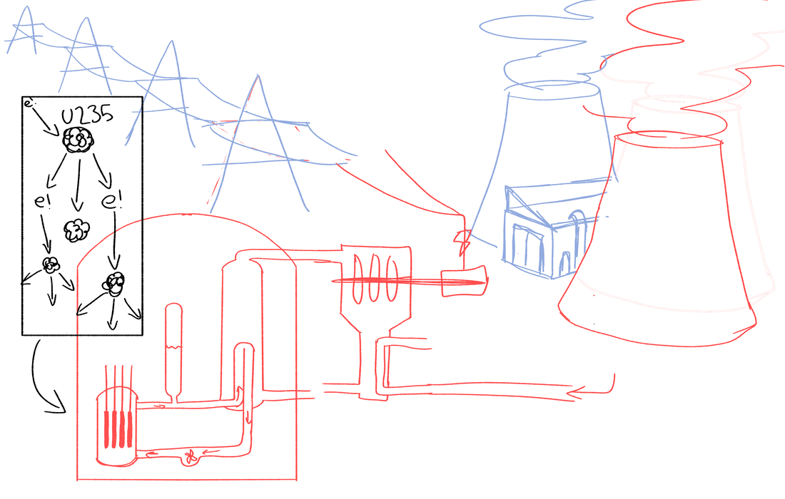
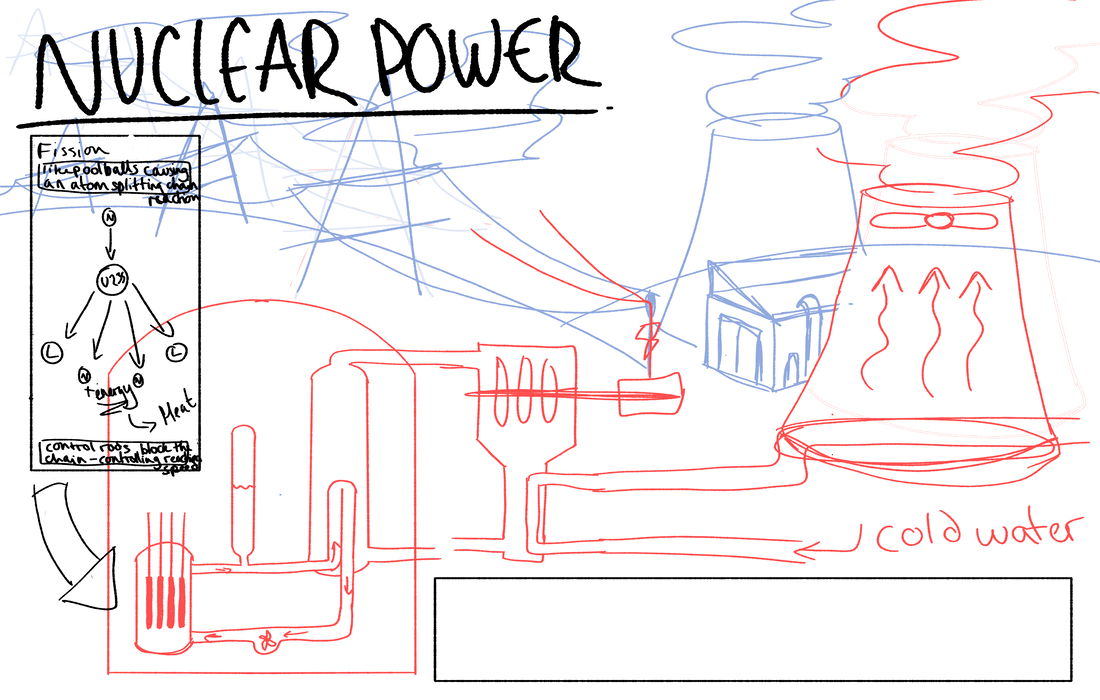
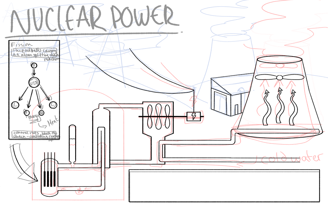
Red is foreground, laid out as a flat informative diagram. Blue is the more decorative background to make the diagram less soul sucking and visually jarring.
|
|
|
|
|
|


|

|
|
|
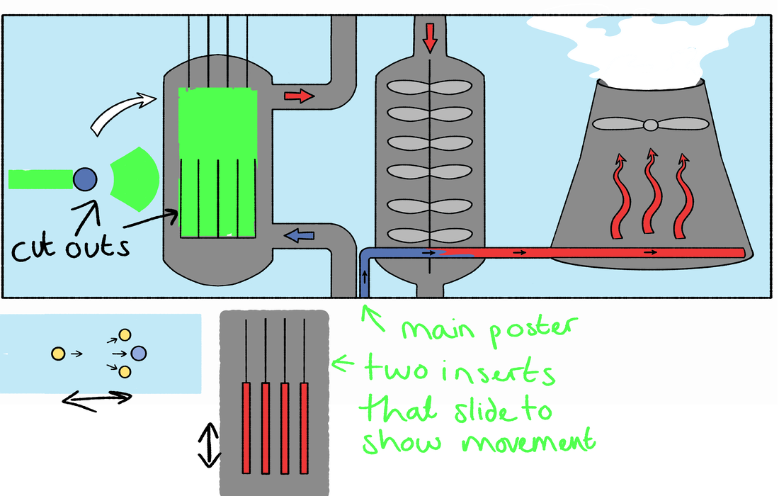


Final poster