Project one - the comic
|
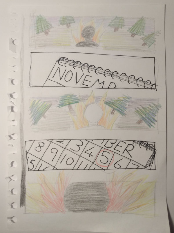
Our first project was a team effort to make a comic based upon the poem Remember Remember.
Forcing us to test our collaborative skills early on really threw us into first year, and I found it very helpful in getting conversations started with others on the course. Overall our group worked very well together, we quickly began to make a story board using the lines from the poem and divided up the pages between us, we decided on the story we wanted to tell through the colours and design choices, and we got to work on our individual pages. We held regular checkup meetings to see progress, and efficiently made decisions or changes we needed to effectively splice our pages together. A few mishaps lead to a small panic in adding the wording, which could of been avoided with better time planning - lesson learned. |
|
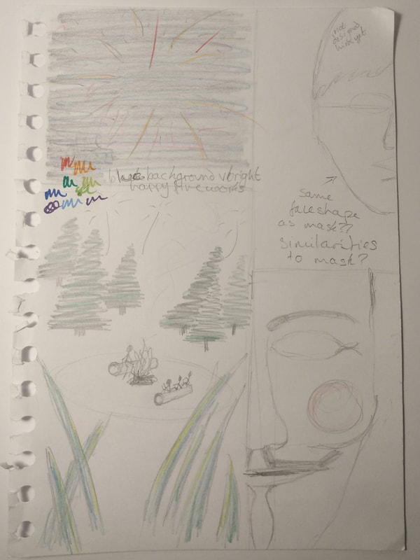
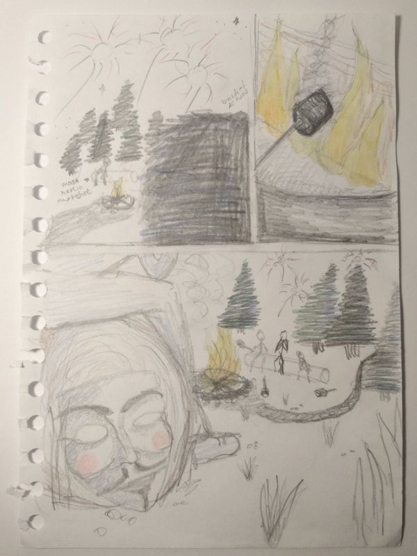
Here you can see some of my planning sketches, laying out the shape of the drawings and starting on a colour palette.
One thing I was regretful of is that as all three of us illustrated, our styles are slightly mismatched, we attempted to use our different styles to show the varying tone of each page, from light to dark to darker to light again, but it still looks disjointed. One thing I really did like about this is that it allowed me a little freedom to attempt some illustration, while I am a graphic design student its always fun to step outside of that box and try different things. I would say the first project went really well, I was happily surprised by the ease at which we all worked together and impressed by the image we had tried to create, and the inspiration that came from working with others and having more ideas flying around the table. |
Project two - technical skills
|
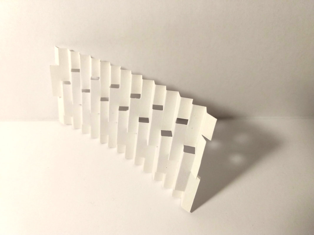
vaThe next project was based on paper craft. Practicing restraint and skill in accurate cutting and sticking.
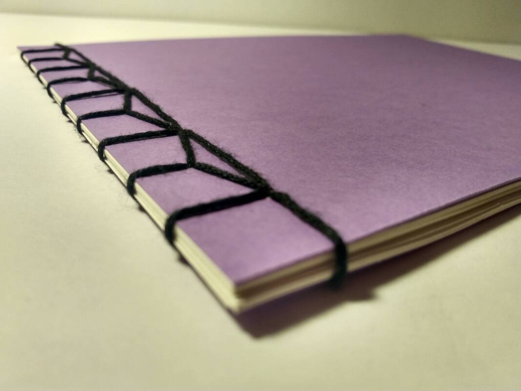
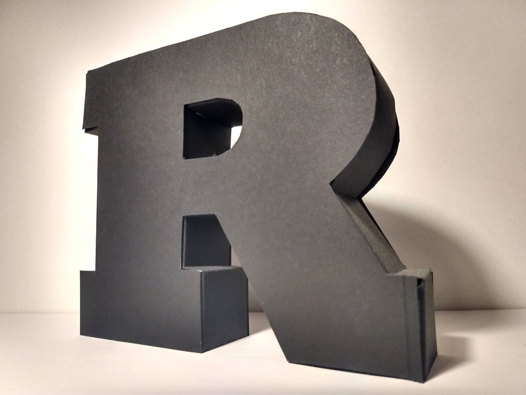
This is not my forte. An enjoyable hobby I do already? Yes. Something I am well skilled in? Less so. However I was very proud of my paper R, even though it took me 4 attempts and a migraine to achieve. I completed a variety of tasks involving cutting perfect circles out of a5 paper with a knife, drawing a square in pen in the center of layout paper, making 3d shapes, practice various mounting techniques and binding my own books. The books were very enjoyable to make, its something I do already in my spare time with scrap papers of all different textures, and this encouraged me to look at different types of binding I otherwise wouldn't of tried. |
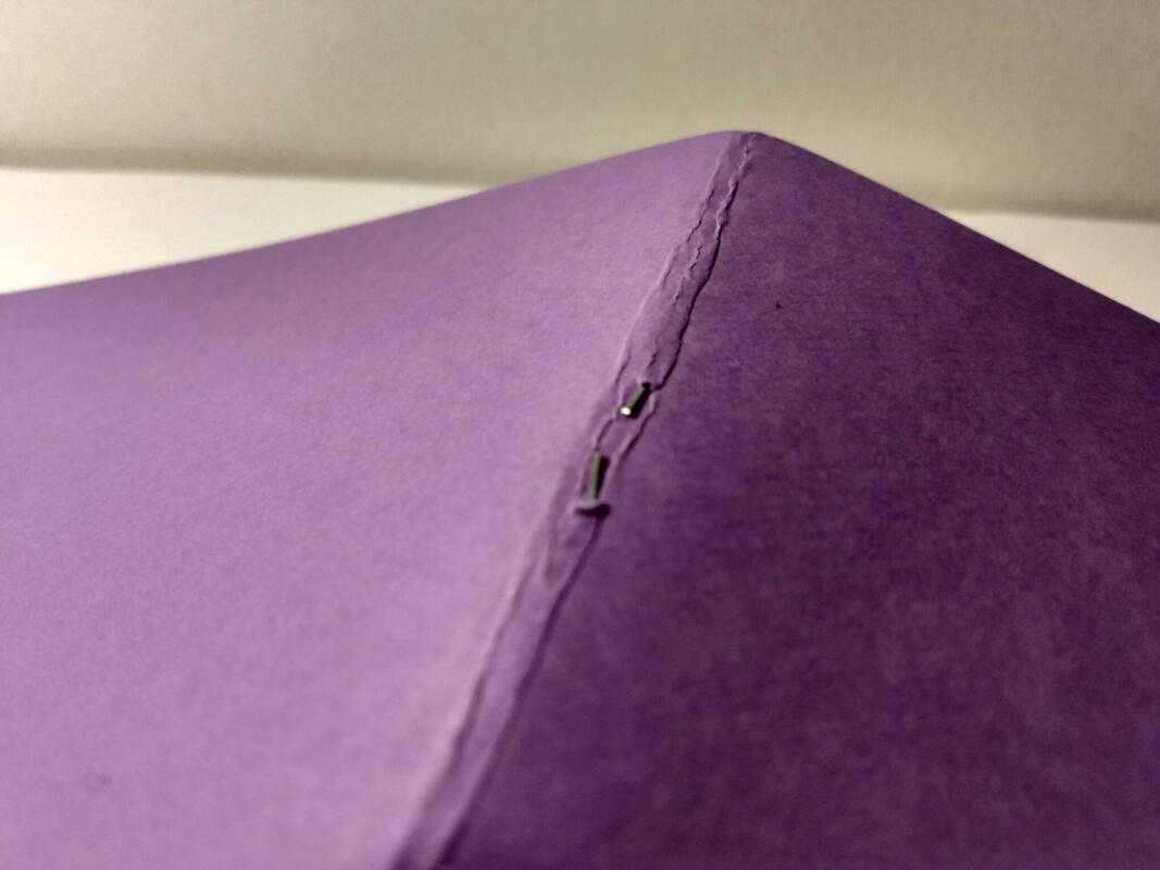
My first book was stab stitched, and inside were square holes cut from 40mm down in 2mm increments. This was excruciating, and for an unknown reason when it came to binding the book half of the pages sat wonky even though they were all punched through with a pin perfectly aligned. Another lesson learned, measure twice, sew once. The second book was stapled by hand and had evenly spaced holes punched down one side.
|
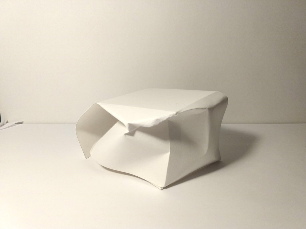
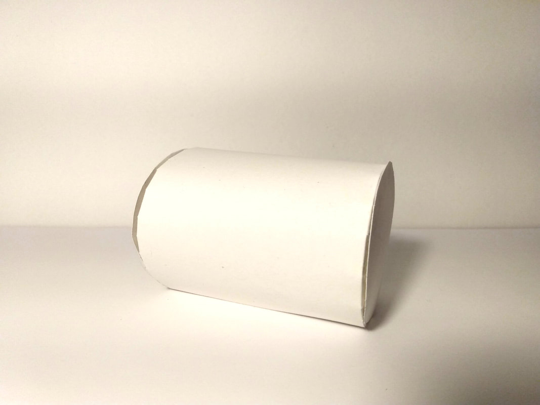
I like to call this piece "a lesson in properly transporting fragile objects across Carlisle" as I unfortunately crushed my 3d cube on the way home. The connection from the top edge of the cylinder was difficult to achieve and took a few attempts before it worked well enough to stay attached, however the pyramid was far more successful and looks crisp and clean.
|
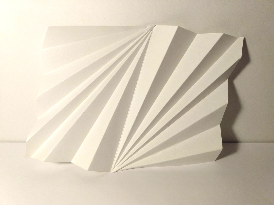
The paper folding task was very satisfying, I had a lot of fun hypnotically folding line after line of crisp paper into shapes. I learned very quickly it is important to score the lines to get a sharper fold.
I also learned that embossing works better on thick paper than thin, as my embossings only faintly showed. |
For the paper sculpting task I made the Gentry crest as I liked the simple Tudor rose design, it was hard and finicky work getting all the tiny pieces and cuts properly glued together without making a mess, but worth it for the final design.
|
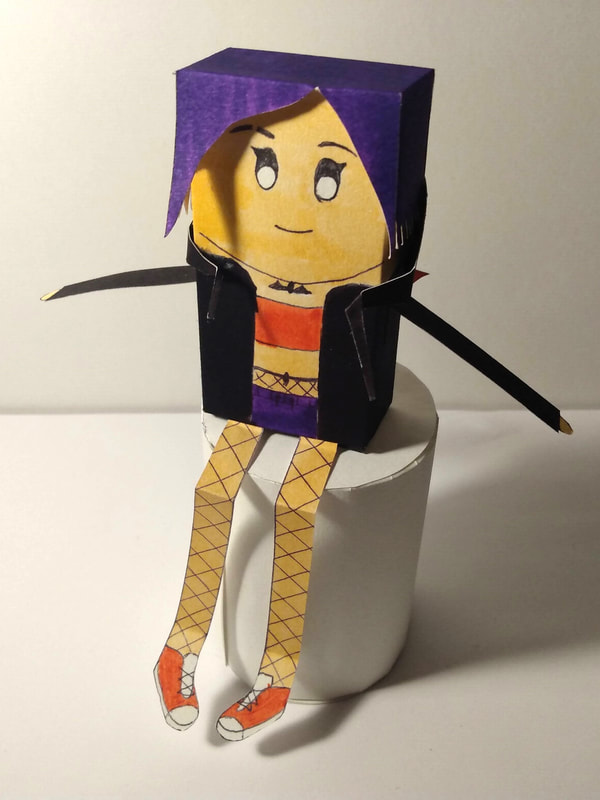
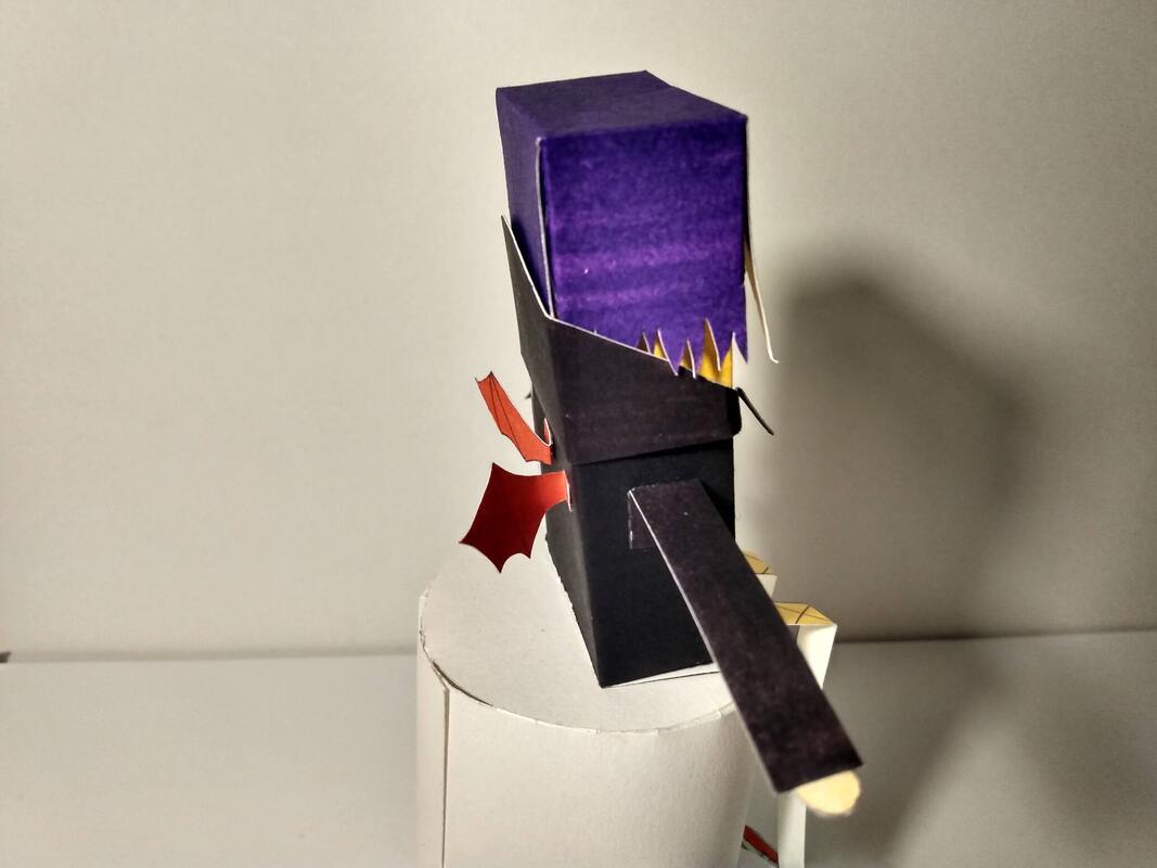
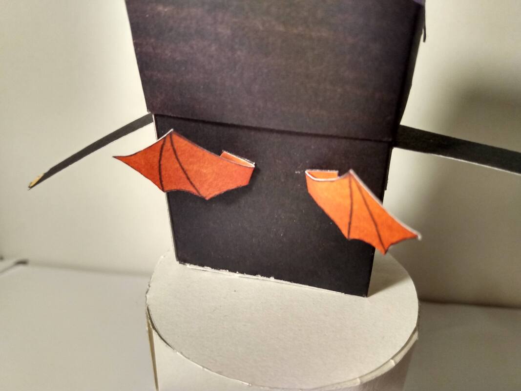
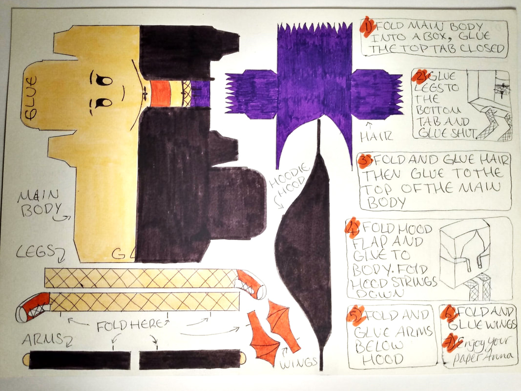
The end of this project was building a paper model based on me, including the pattern page to cut out, and the finished doll. I spent hours trying to think of the best shape to use for the base that felt like me, I went round looking at card packaging in the supermarkets, and when I was at my wits end I realised my e-liquid box was just the right size to be a paper model, so I adjusted my designs to fit my new model shape.
I gave my mini me matching purple hair, my favourite hoodie with bat wings, fishnets and converse. I even added my little bat necklace and eyebrow slit. I chose to go more literal over metaphorical me, as I liked the idea of having a literal tiny me doll I could keep on a shelf. I gave her long flat legs because as my mum puts it, I am "ridiculously long" and arms to match. I made a scrappy version of the basic shapes, then gently marked my design idea onto the doll and took it apart to make an accurate design that would perfectly line up, once I was happy with it I took the design and traced it onto card and coloured it in, making two copies. One stayed as the sheet, the other was constructed into the final doll. The hair and hood took a lot of trial and error to make fit right, but the design didn't get tweaked much from the first round of sketches as I liked it so much. |
project three - drawing and visualising
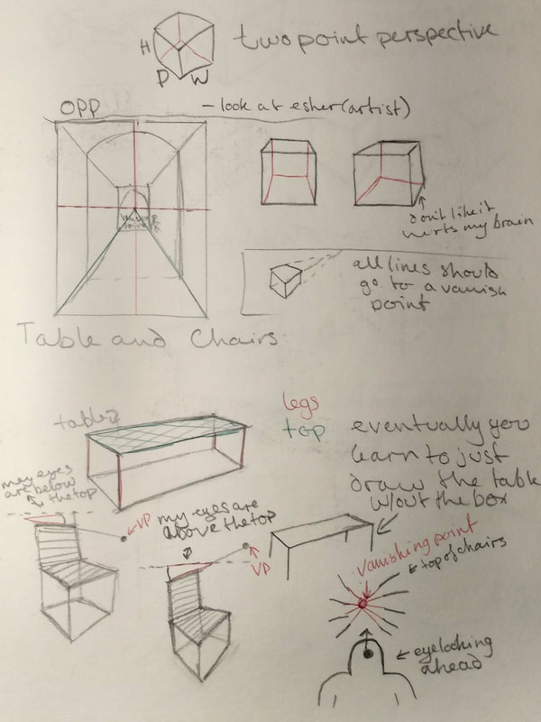
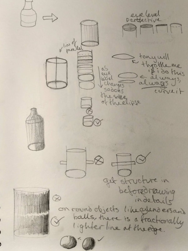
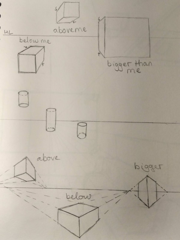
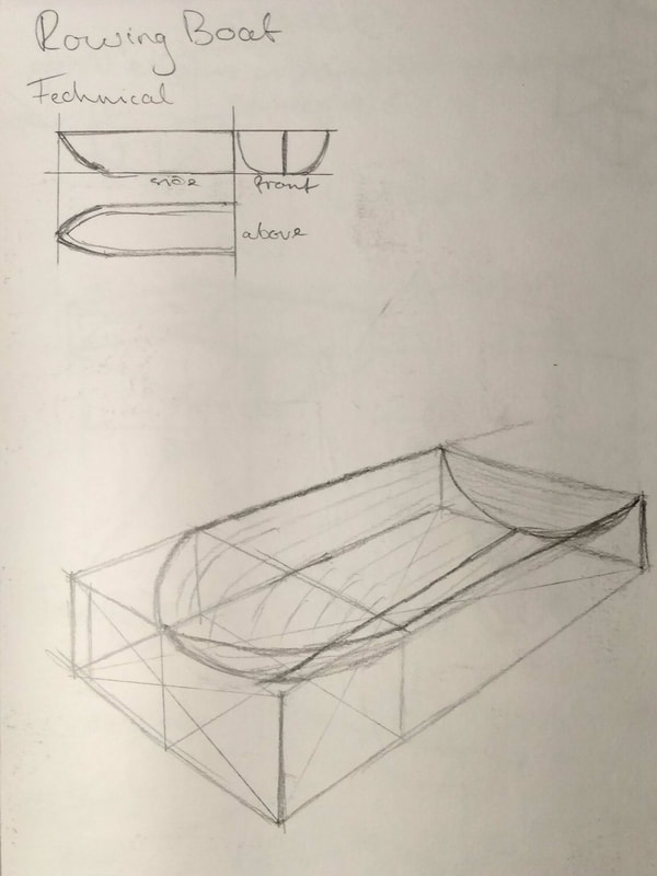
In this project I learned a lot about the techniques of perspective drawing, how to draw things above and below my eyeline, shading on rounded surfaces, how to find the center of an angled face, how the angle of the slice of a bottle or cylinder changes as you move up and down the object. I spent a few days drawing and practicing and I now have a far better understanding of perspective and have learned to look at the world around me and see the line from object to horizon without even thinking about it.
|
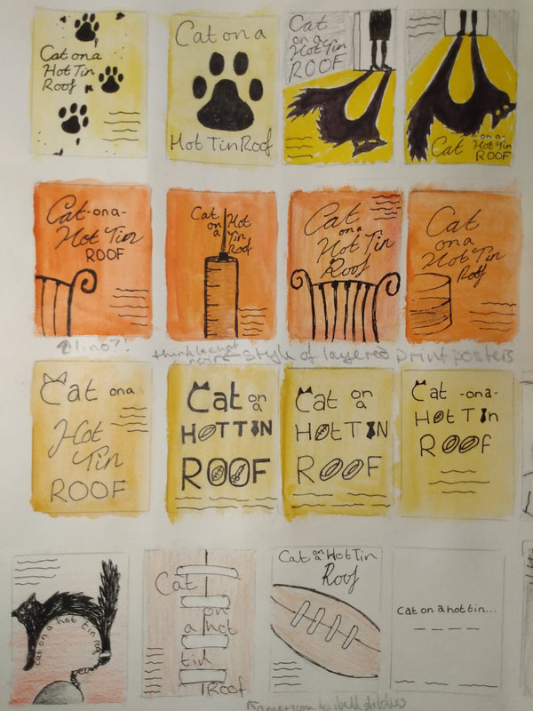
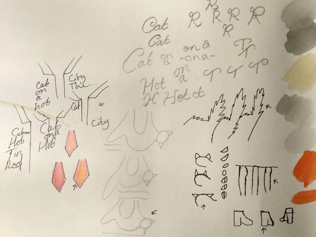
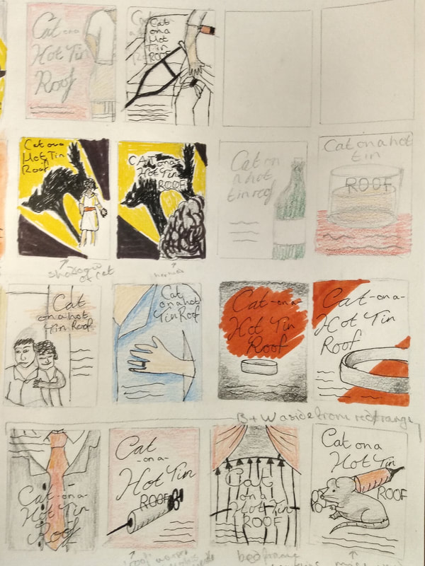
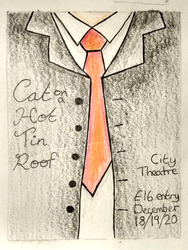
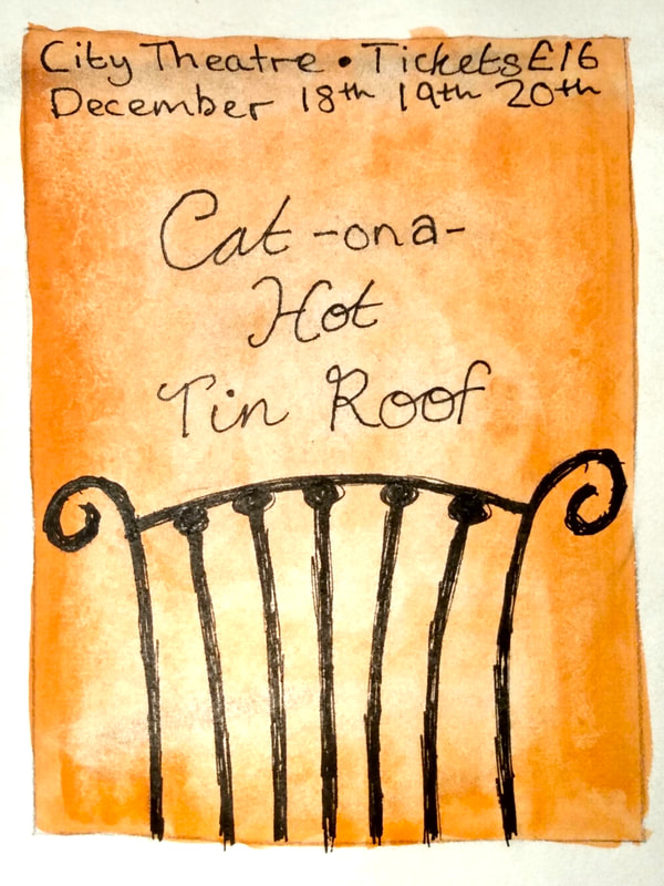
I chose the play Cat on a Hot Tin Roof to make a poster for.
As I couldn't find a place to watch the original play I settled for the 1958 movie, I watched the whole thing through once, then had a break and went about my day and watched it all again in the evening, this time armed with an a3 page covered in boxes to draw out ideas as they came to me. I absolutely fell in love with the story, it's quickly become one of my top favourite films. I tried some modern designs such as using the American football, or the pawprints in ink, and the ring on black and red backing, but it didnt quite feel right. I did eventually come up with a modern design I did like, which was the shadow of the cat coming from a person. I drew up some scratchy black on red-orange backgrounds, mimicking a Le Chat Noir style of poster, as lithographs were still recognisable and culturally relevant in 1950s advertising. I also liked the idea of having an aged photograph of a suit with the text over top, but that was hard to show through coloured pencil drawings. I carefully thought about how to make the text look, the angle of the tie, the spikes and eyes on the cat, the layout of the informational text, and the specific colours to use. Overall I liked the cat shadow the best, but I would love to make the lithograph inspired one properly with lino or block printing. I really enjoyed the inspiration and creativity this particular task gave me, but I am not happy with my final pieces and want to make them more polished. |
project four - colour composition
|
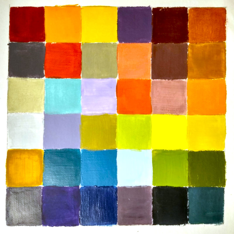
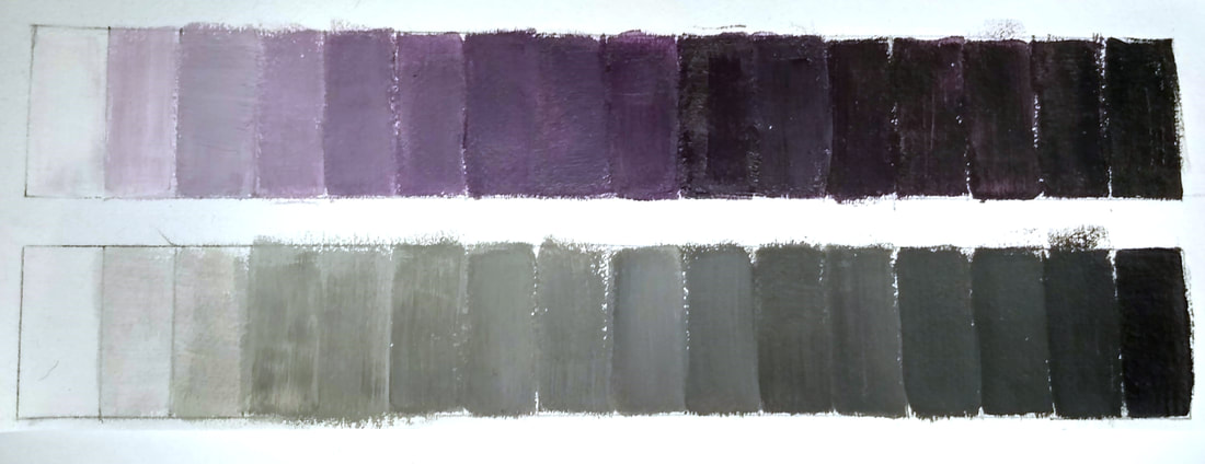
This project gave me much needed practice in colour mixing with paint. I managed to nail mixing palettes that fit themes, and learned a lot about tones and shades of colours and how they evoke different feelings or memories. I am convinced purple will always be difficult to mix though...
I painted a black to white scale, and a colour wheel, then spent a few hours playing and mixing paints till I made colours that I found interesting or eyecatching. I then created six paint palettes that fit different moods, neutral sandy tones and bright colours for Mumbai; soft warm oranges browns and greens for Autumn; blues, pastel green/pink, greys and red for Hospital Ward; bright dark greens and some bright colours for Rainforest; dark blues and bright yellows for Blackpool (specifically visualised as at night); and faded blues with dark bland greens for Misty Morning. |
|
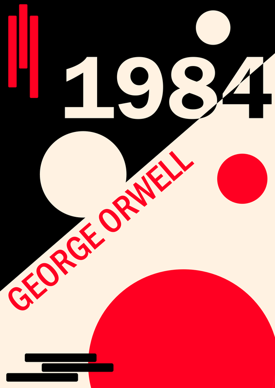
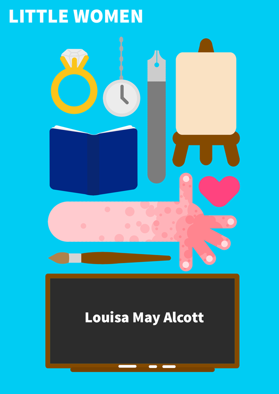
I was tasked with looking at the work of El Lissitzky, Peter Grundy, and Vaughan Oliver, then applying the techniques I collect from their work onto three book covers for Little Women, 1984, and Oliver Twist.
I paired the artist and books as; 1984 - El Lissitzky Little Women - Peter Grundy Oliver Twist - Vaughan Oliver Lissitzky was perfect for 1984, a fictional dystopian nightmare written as a cautionary tale, Lissitzky's style feels like a Russian propaganda creator took up a new job making Bauhaus styled album covers. He used lots of off white, black and red, along with stripes, lines and circles, taking full advantage of the shapes that can be created in negative space. Little Women, like most books, has lots of little details that only readers (or synopsis speedreaders like myself) would know, I wanted to take advantage of that by using Peter Grundy's style that often contains multitudes of little images all in one poster or informational piece. The sisters smallpox ridden arm, the writing pen, the canvas, the love heart and wedding ring, the chalkboard, looking at that and the title you'd be confused and intrigued about what the hell any of those things have to do with little women, but if you know the story you'll pick up on where those things fit into the book. His style being so simple and easy to replicate as a non illustrator made sense to use on a cover where I wanted to draw lots of little things instead of having an abstract idea of the story's theme. Vaughan Oliver's style fits the story of Oliver Twist well, the darkness, confusing chaos, layered images, ragged old look with lots of texture, it truly fits the story of a little orphan boy and his troubles in life. I really struggled to replicate Oliver's style, it was so confusing and layered that I failed to even see what some of his pieces were, but I attempted to layer original illustrations from the book, using textured brushes and splashes of colour, I did a passable attempt at coping his technique. I am not happy with it, but I am also at a loss of how his creative process works, and I don't think I could ever replicate it. |
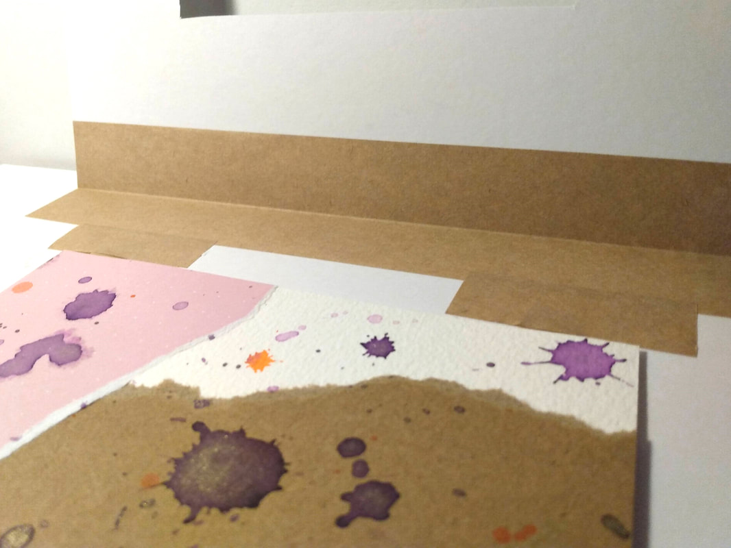
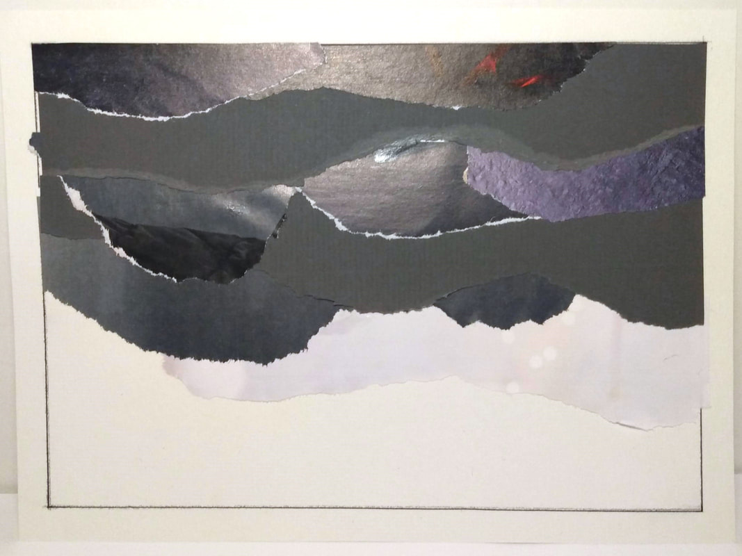
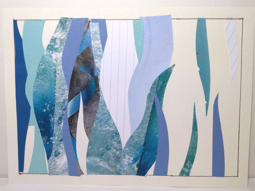
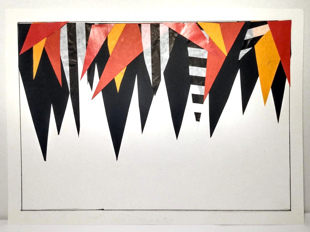
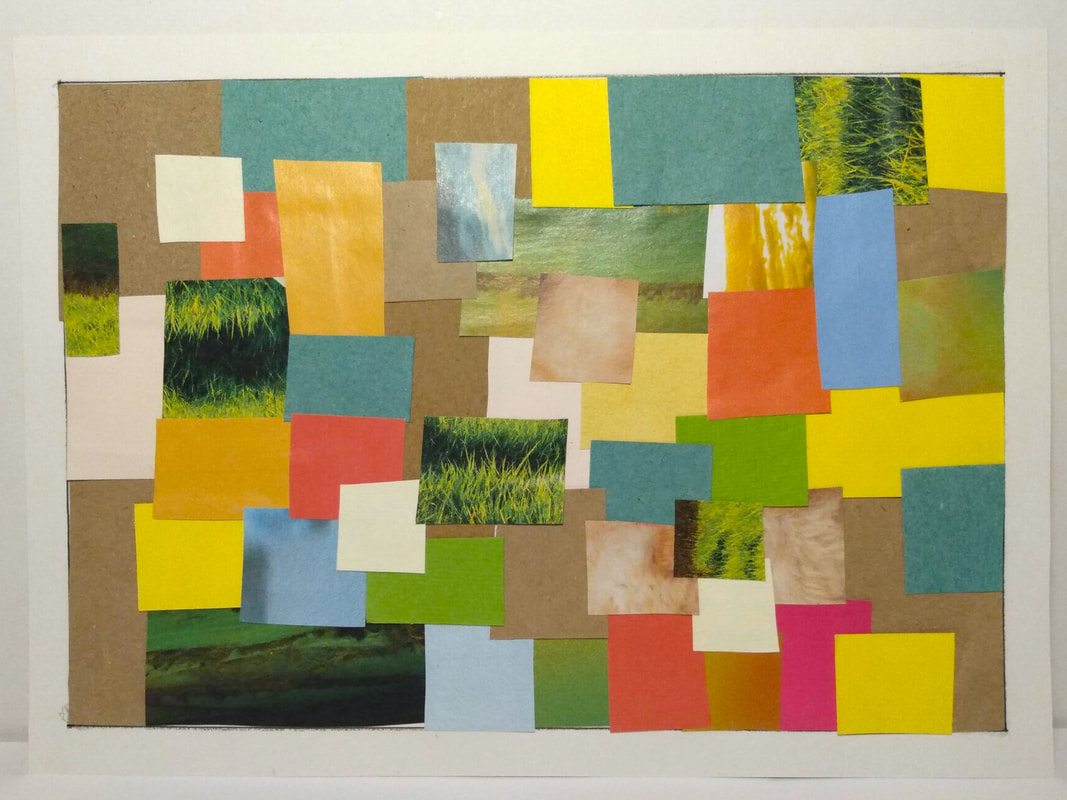
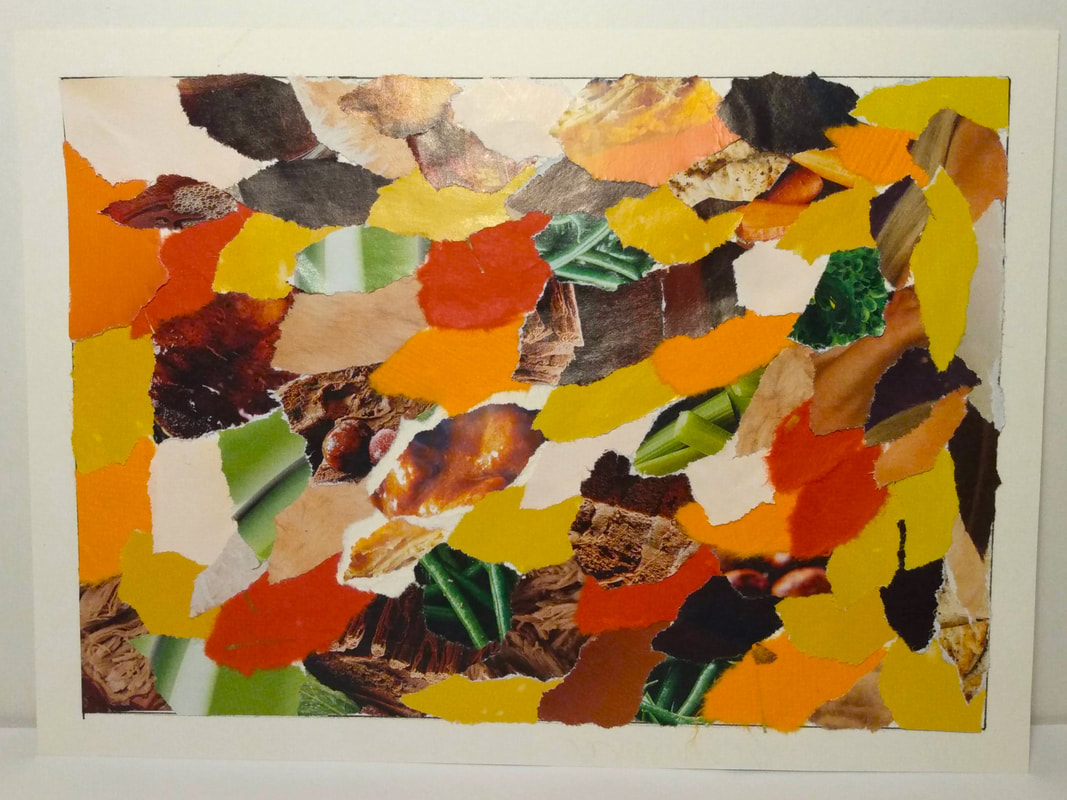
The next task was to create collages that fit the following six themes; threatening, Mumbai, on the ice shelf, sensual, autumn and storm at sea. I used a variety of papers, from handmade scrap paper to magazine clippings, plain card and old recycled packaging.
|
|
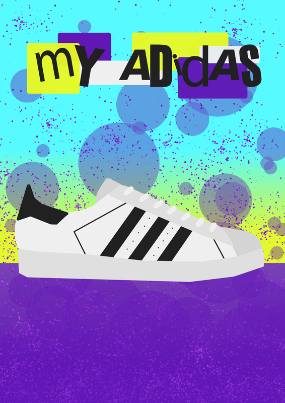
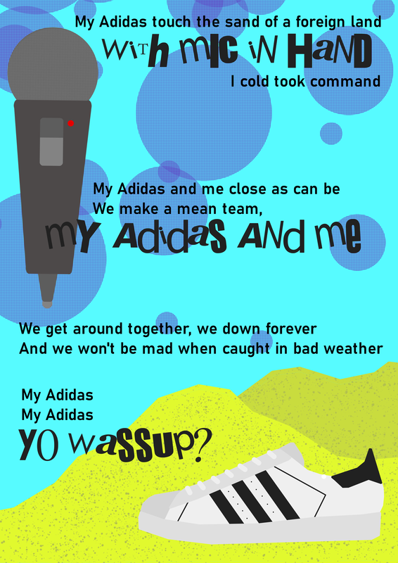
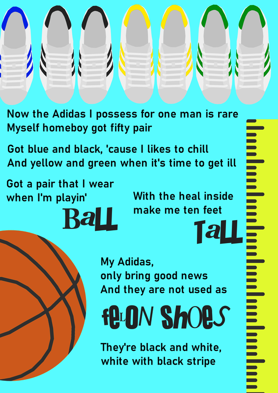
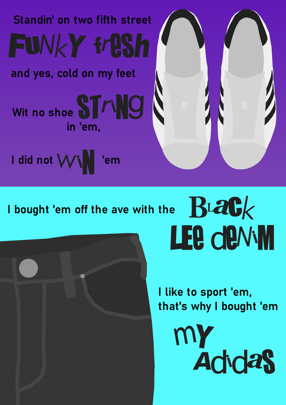
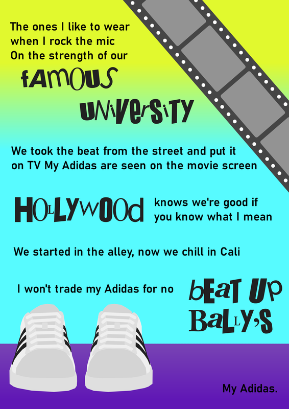
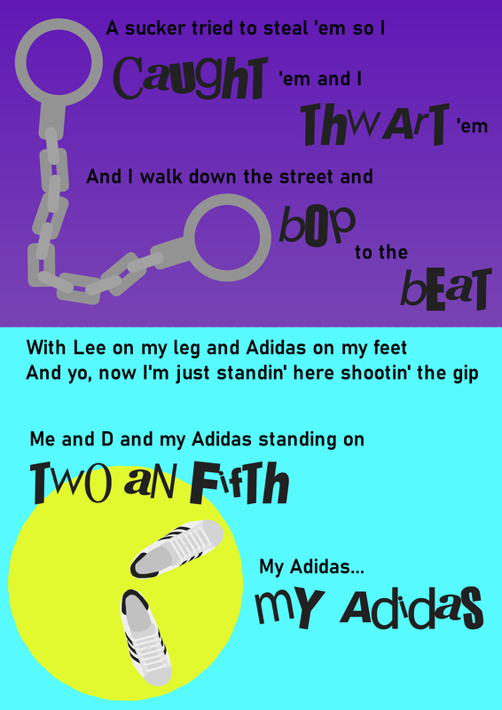
My final piece of work for the semester was to create an 8 page book detailing the lyrics of the song My Adidas, not as an ode to the musician, just focusing on how to place words together with imagery.
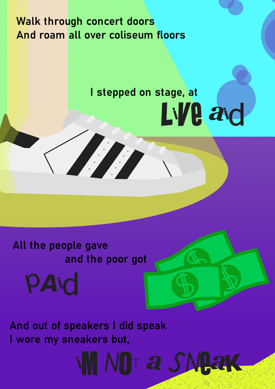
I spent a while thinking about the style, colour palette, etc, and due to the songs snappy lyrics I chose to have a sharp blocky style of illustration, with a careful small typeface to show the thought and careful craft of the lyrics along with a bold crazy Sex Pistols font to match the upbeat energy of them. I chose a bright 90s ski jacket colour palette and used a dotted pattern that I can only describe as the backdrop to an early 2000s kids TV show. I carefully drew a pair of Adidas shoes in different colours and angles, taking inspiration from Peter Grundy as I found that style quite fun and easy to create without needing a drawing pad. I made references to the lyrics by making handcuffs, money, using shoes as hands on a clock pointing at 2 and 5, old film reel, basketball, etc. I had a lot of fun making it, however as I mostly listened to the song on repeat while making it to help stay mentally on task, I have now ruined my Spotify algorithm forever. If I could start again from scratch I would change the pacing, as the lyrics are sporadic at the start and stuff the page towards the end, which makes it feel rushed. |
|
Page 2 & 3 fit well together as a double spread, but sadly I neglected to remember that for page 4 & 5 beyond the purple background, and they look quite separate. I am very happy with page 6 & 7 though, and I love that it looks almost like a children's storybook, which is oddly absurd given the context of the task.
|


