ACTION
|
|
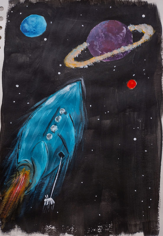
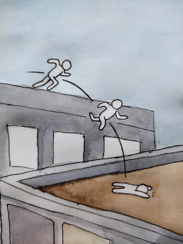
I struggled with the technical side of painting, I kept messing up while trying to use acrylics. I have an awful habit of using all other paints like watercolour, but it kind of worked out by the end. I am not 100% happy with these, but I had a lot of enjoyment from the fight of working out different ways I could show movements with the different scenes.
I also found this student resource from the tate modern that was very helpful in identifying different ways to show movement. https://www.tate.org.uk/art/student-resource/exam-help/dynamism-and-movement |
|
|
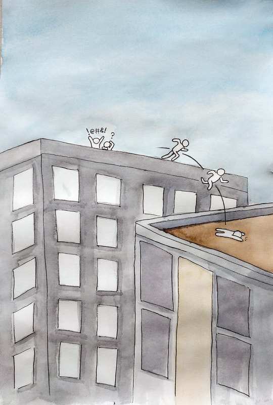
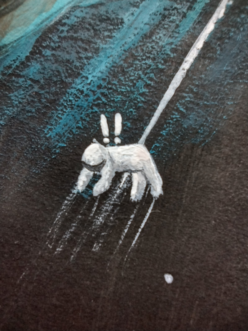
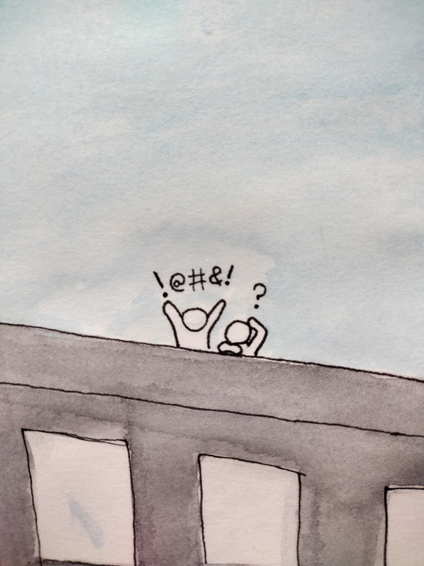
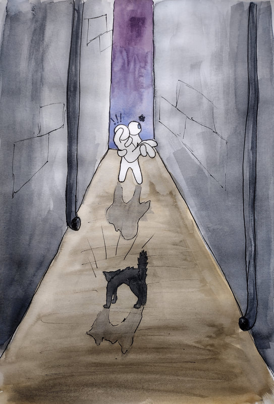
I chose the comic style, inspired by illustrator TheOddOnesOut, as I like his very simple design for the "self insert" main character. I wanted to see if I could show movement and emotions with no facial features or distinct features at all really. I think I nailed it.

|
|
|
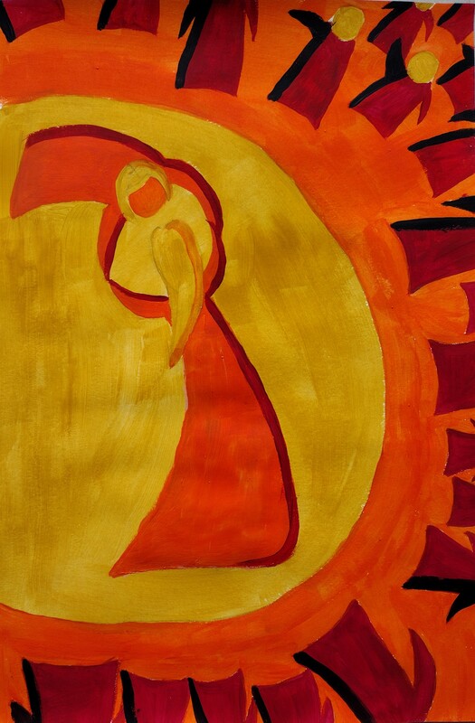
I struggled to design a good image for Tango, and when I went back to reread the breif I knew I needed to try in this style that was shown. I think I ended up more with "fierce" rather than sexy, but I still like it.
|
|

|
|
|
Communicative colour
|
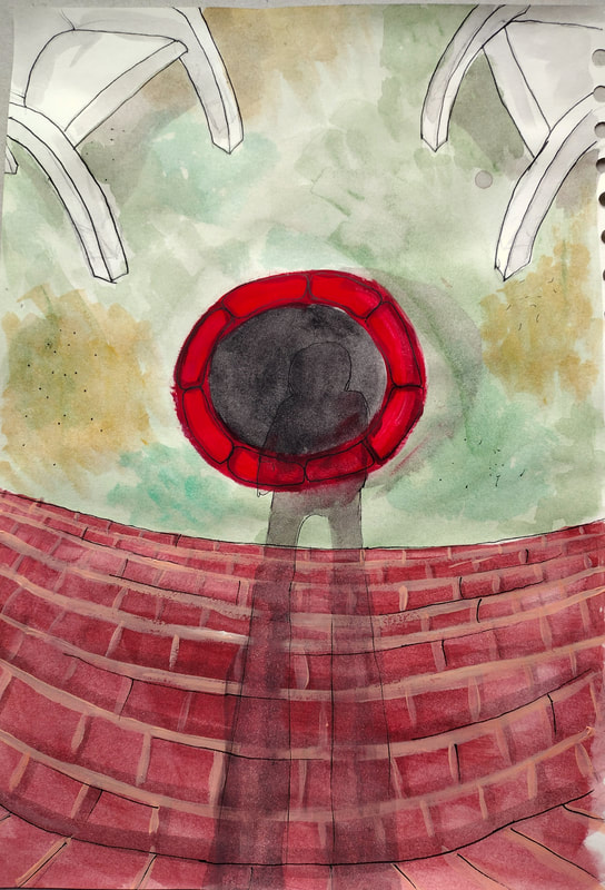
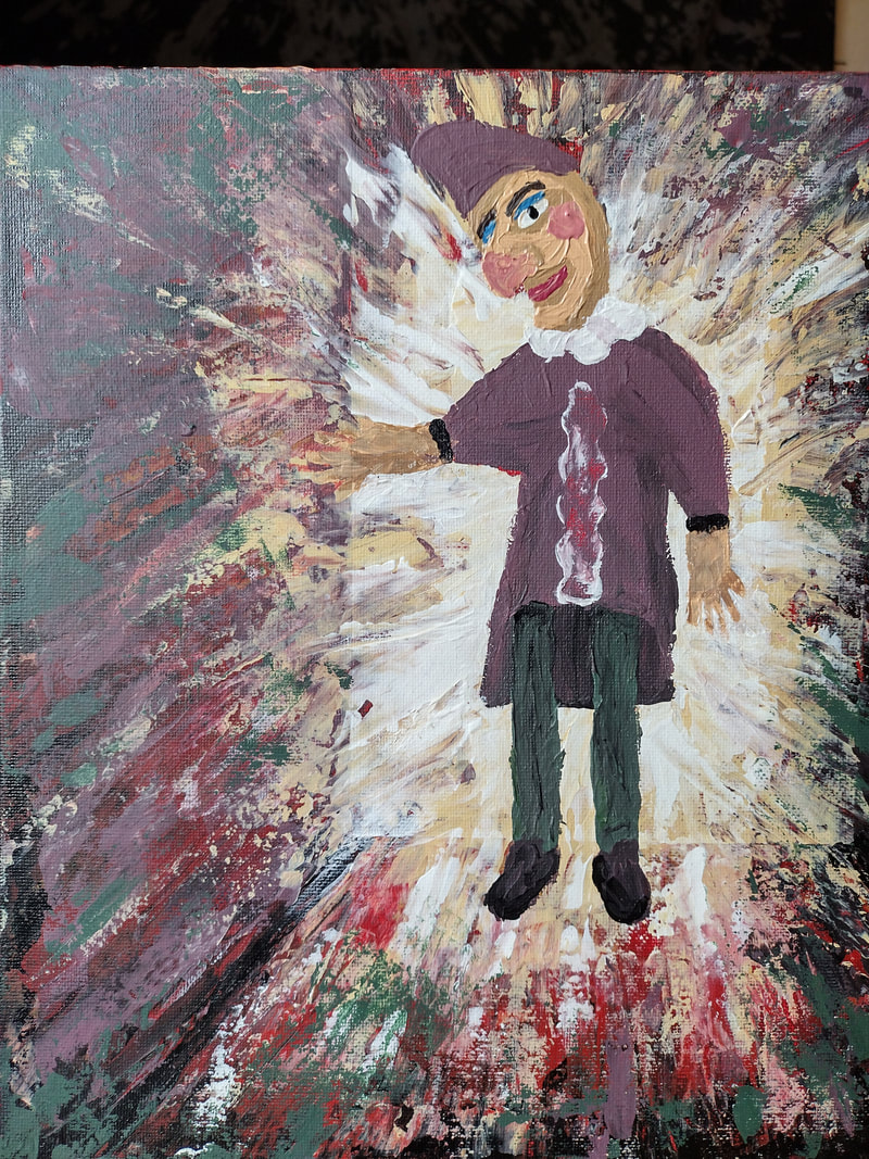
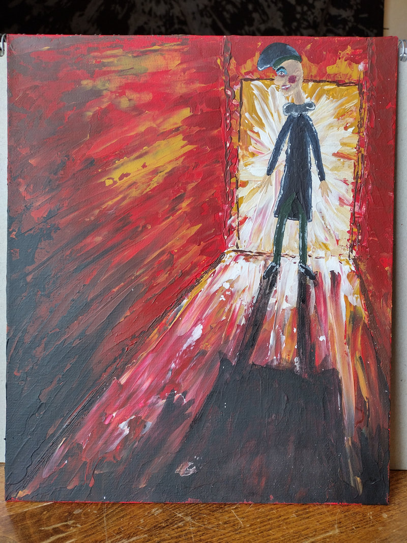
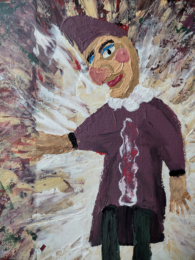
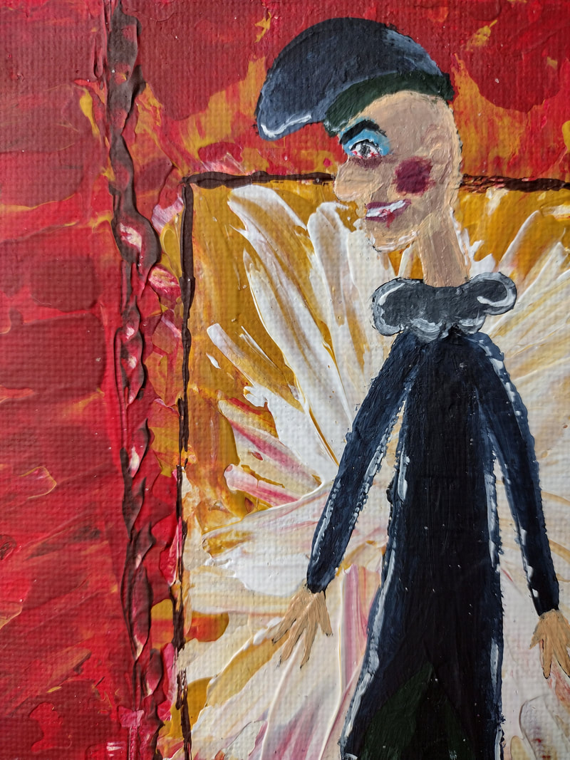
I thought for a little while about where I could take a wifebeater puppet as a painting, so I did some research and found out Punch used to be on strings, which reminded me of the creepy scene in Polar Express with the puppets in the carriage, which also reminded me of the popular horror game series Five Nights At Freddies.
Punch, like the haunted animatronic suits in FNAF, is objectively a "bad guy" and a creepy little thing. So I leant into the idea of having punch in a hallway, blocking the way out, and you cant tell if hes alive, or dormant and just hanging from his strings. I did two versions of this painting as I disliked the first one and wanted to try again. In the second one I gave punch a black, bloodshot eye. Someone had to give him one eventually. The painting ended up super creepy I like it. |
|
|
|