1) Dressed to kill
|
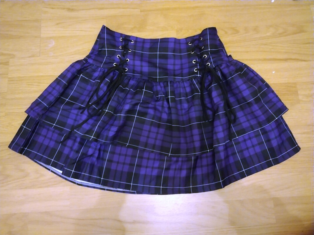
A short layered plaid skirt is certainly a more decorative piece of clothing than a functional one, the different layers of fabric cause it to use more resources than necessary in order to achieve the silhouette desired, a flare outwards from the waist and a sharp edge, making the legs appear longer and thinner by comparison. The fabric (whether woven or printed) requires more effort and time to create than the average piece of plain cloth, adding to the effect of being a statement piece, 'this must be a meaningful or loved item to have that effort made!' kind of feeling.
Plaid as a pattern has its history amongst the Celts as a symbol of comradery and tradition in the face of the English, similar to denim it used to be seen as the uniform of pioneers and working class, such as lumberjacks, tradesmen, and those who worked in rugged environments. As the trend moved towards counterculture (particularly amongst punks) it become symbol of the youth striking back, being shocking, outrageous, and plaid went from just being a strong mans woven wool to being printed on all sorts of fabrics, made into bags, tea cosies, biscuit tins, everything under the sun. This has given plaid a bizarre association of being simultaneously a symbol of bold brash clashing for power against the monarchy, the politicians, and outdated conservative ideals, and also being a symbol of the British, the monarchy, shortbread biscuits with tea, plastered on the sort of tourist trap tat that a middle class grandma keeps in "the good living room" with her royal albert tea set and her hatred of anything "un-British". This can be witnessed particularly ironically when looking at school uniforms. Make a knee length plaid skirt and pair it with a white shirt and you're off to Catholic School, make it mid thigh and an unsightly colour (anything other than red or navy) and suddenly you're seen as an unruly youth who's going to graffiti under a bridge and worry peoples dogs. The colour purple used to be an expensive dye that signified wealth, as it was hard to acquire strong dark colours of dye such as dark blue, dark purple, and dark red. The more common and easily found dyes were in the browns and neutrals area. Despite it not being the case anymore, the stigma sticks, and dark purple gives off a certain weight in its energy and the emotion it evokes. |
Relevant links"Tartans are weaves of alternating bands woven at right angles, while “plaid” originally referred to the heavy woolen clothes that bore this pattern. Scots would use them as blankets or would sling them over their shoulders. When tartan crossed the sea to the New World, “plaid” and tartan became synonymous."
"One of the earliest references to the use of tartans by royals was by the treasurer to King James III, who in 1471 purchased a length of cloth for the king and queen. King James V wore tartan whilst hunting in the Highlands in 1538, and King Charles II wore a ribbon of tartan on his coat at his marriage in 1662."
"In the 16th century, Elizabeth I refused to allow anyone except her innermost circle to wear purple, while Elizabeth II made her way through Westminster Abbey during her Coronation in a Robe of Estate composed of more than 22 metres of purple velvet. See, too, the Imperial State Crown that rested on Her Majesty’s coffin during her funeral, which features a purple cap lined with ermine."
"In 1856, 18-year-old English chemist William Henry Perkin accidentally created a synthetic purple compound while attempting to synthesise quintine, an anti-malaria drug. Recognising that the compound could be used to dye fabrics, he patented the dye and manufactured it under the names aniline purple and Tyrian purple. The colour’s name was later changed to ‘mauve’; based on the French name for the purple mallow flower."
|
2) Semiotics
|
Shows, sports, games, basically any media, subgroup of people, or culture has a semiotic code that is made understandable by reinforcement and repetition. Even by talking about video games as I will in a moment I am speaking in a language/a semiotic code that only some people will completely understand, but a lot of people can use connotations and denotations to make an educated guess on what I am trying to communicate.
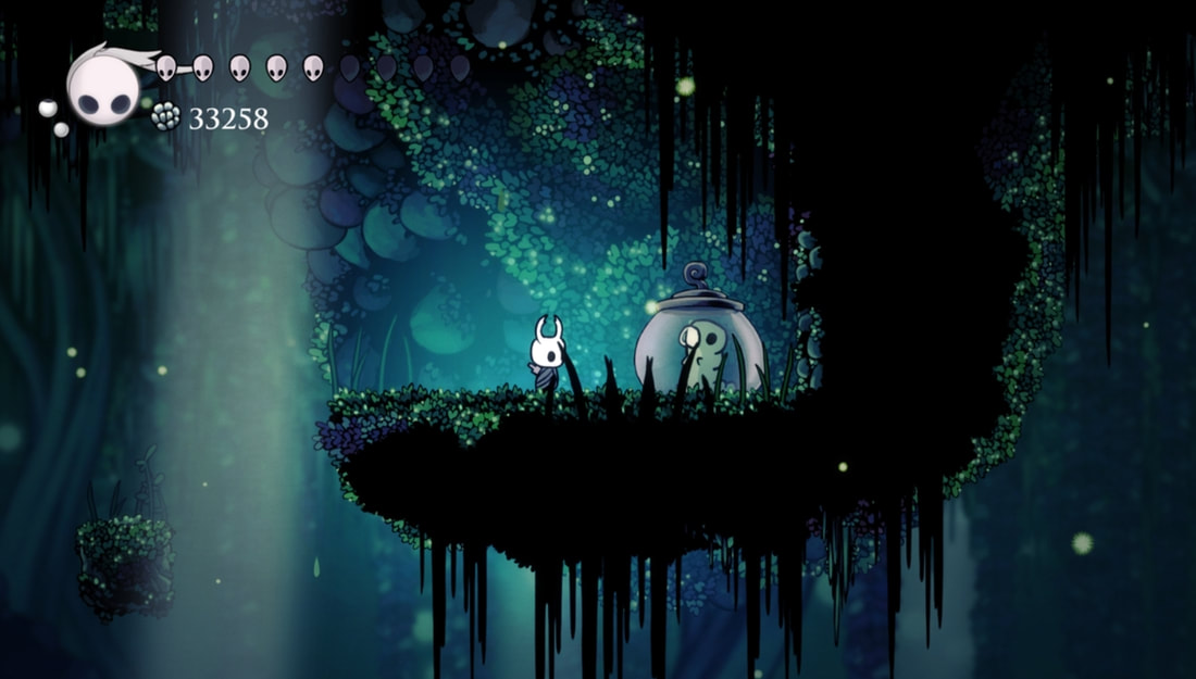
For example, if I say to a random person on the street "I'll do my work, for the cutie" theyre not really going to have a clue what I'm talking about. As I'm sure you reading this probably dont either. Maybe you could try and put some denotations together from typical associations of doing something bad in order to get a good reward, or the association of cutie possibly meaning an animal, so perhaps I mean doing chores so I can get a hamster? Only having access to a linguistic and denotated understanding makes it very hard to discern what is meant. If I add the visual parole (the image at the side) it becomes a little clearer. We can work out the cutie is likely the non threatening (identifiable from it being very curvy, a soft green colour, and being entrapped) grub inside the jar. The jar is on a platform with another creature, it looks like a hidden corner that is hard to get to, maybe this is a difficult task done to find "the cutie", but its nearly impossible to work out more than that, there isnt a full language laid out to understand, its a snippet of the full context. However, someone who is in the community the comment is from, has a bucket full of context, associations, connotations, all that give extra information to understand and recognise that phrase and others like it, where the average person only has denotated signs, they dont understand the deeper associations. The phrase is from the game Hollow Knight, the player character is the horned white masked creature from the image, and the grub is the creature in the jar. The phrase "for the cutie" references a joking affirmation phrase people repeat while doing unbelievably hard parts of the game in order to find and collect all of the grubs to send them home, after learning they have been entrapped by a creepy monster. The grub savior quest is entirely unrelated to the main story, you can ignore it and finish the game. If you say "I'll do my work, for the cutie" to someone from the community, we instantly know that its being used to describe something tedious, painful, time consuming, frustrating, something you truly despise doing, but you're willing to suffer through it just out of pure love for whatever prize you get at the end despite it being entirely optional to do, or at least put off for a while. It is a nerdy, game specific version of "no pain no gain" or "pain is temporary, cool tattoo is forever". With that being said, I'll finish my degree, just for the cutie. Self crit this weekWork more on properly using the new terminology in cohesive sentences. I understand what I'm trying to say, I just need to learn to say it properly, and use the words correctly.
Continue to use the terms, even if not properly phrased, to reinforce understanding and usage. If I'm afraid to use a word in case I get it wrong, I'll never get anywhere. |
Signifier + Signified = Sign
Language = a whole language system made of signs Sign = single word Parole = partial example/snippet Syntagm = complete ordered sequence of signs Paradigm = a point of substitution that allows for a word to be swapped RELEVANT LINKSSemiotics is very interesting, I can literally link you to a video of a part of the game called "Path of Pain" and while you might understand its meant to be hard, if you haven't played it, you'll never truly grasp how agonising and painful it really is. You simply cannot have the entire context of the language created in the collection of signs, feel the tension of each movement and know the struggle the player is going through without actually playing it.
Just like how a non musician, or even just a non pianist wont ever truly grasp how stressful and difficult it is to play Rush E, we can understand its impressive and hard, but unless we have a go at it and have an "ooohhhh no, thats really hard" moment, it just wont quite click because we lack the first hand experience to make the connotative associations based on the signs.
Theres a beautiful irony to reinforcing my understanding of semiotics through repetition, the semiotic code of the semiotic code if you will.
These are just some websites I looked at to reframe and solidify my understanding of the terminology and application. I understand random blogs are not a good source of new information, but different peoples interpretations and rephrasing of topics is something I do find helpful to bolster my understanding, along with trying to reframe the knowledge by associating it with a passion or hobby of mine, so my brain remains interested and engaged on the topic, and more likely to remember it. (Hence talking about a seemingly irrelevant game, that's gonna happen more than once on this blog... sorry) |
3) Reading words and images
Denotation vs ConotationDenotation is the most immediate understanding with little consideration given to the context or other meanings of the image or word. Connotation is what we realise when we sit with the word or image for a while, and mull it over. We notice new links, new signs, new contexts that allow for a deeper understanding and a more thorough revelation of meaning.
Eg: "Cat" Denotation: small furry four legged animal with a tail Connotation: friendly, royalty, hunter, pest killer, witches, occult, flexible, agile, silent killer, goofball, playful, inquisitive, distant, vocal, elegant, stupid, big cats, domestic cats, historical cats, etc etc AnchorageThere are many types of anchorage, the relays between word and image that add more information in a complimentary way. Images can be given meaning by linguistic assistance.
Word specific: it gives you all/most of the information you need through words.
Image specific: it gives you all/most of the visual information needed to decode the message in the images alone.

Dual Message: words and images show the same meanings, a double whammy of clearly explained information

Interdependent: neither the image or the text can explain it alone, you need both to understand it
Parallel: words and images show two different ideas that don't intersect, they're unrelated.
Self crit this weekPractice evaluating more images/text combos and describing their anchorage, signs, context of the time and culture it was made in, etc etc
|
relevant links“Magritte engaged in a sort of theoretical battle with philosophers,” said Didier Ottinger, curator of the exhibition, “to prove that pictures can portray thoughts on the same level as words could.”
"Surrealism stood for the liberation of the individual from the domination of the rational, a movement that emerged in part as a rejection of the unbearable reality of to the atrocities of the First World War... ...Magritte ‘betrayed’ this text-only world by adding images to the mix." "The painting is not a pipe, but rather an image of a pipe. This masterpiece of Surrealism creates a three-way paradox out of the conventional notion that objects correspond to words and images."
"He consistently interrogated conventions of language and visual representation, using methods that included the misnaming of objects, doubling and repetition, mirroring and concealment, and the depiction of visions seen in half-waking states-all of them devices that cast doubt on the nature of appearances, both in the paintings and in reality itself." |
4) Decoding advertising
|
Analysis of different adverts.
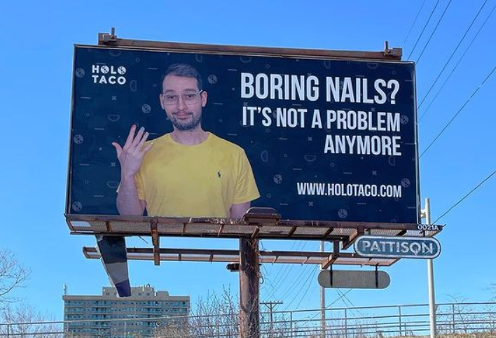
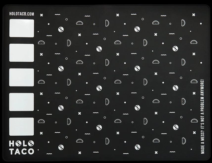
BillboardThis advert is for a nail polish company started by a YouTube creator under the name Simply Nailogical that did nail art, and other daft playful videos, called Cristine Rotenberg.
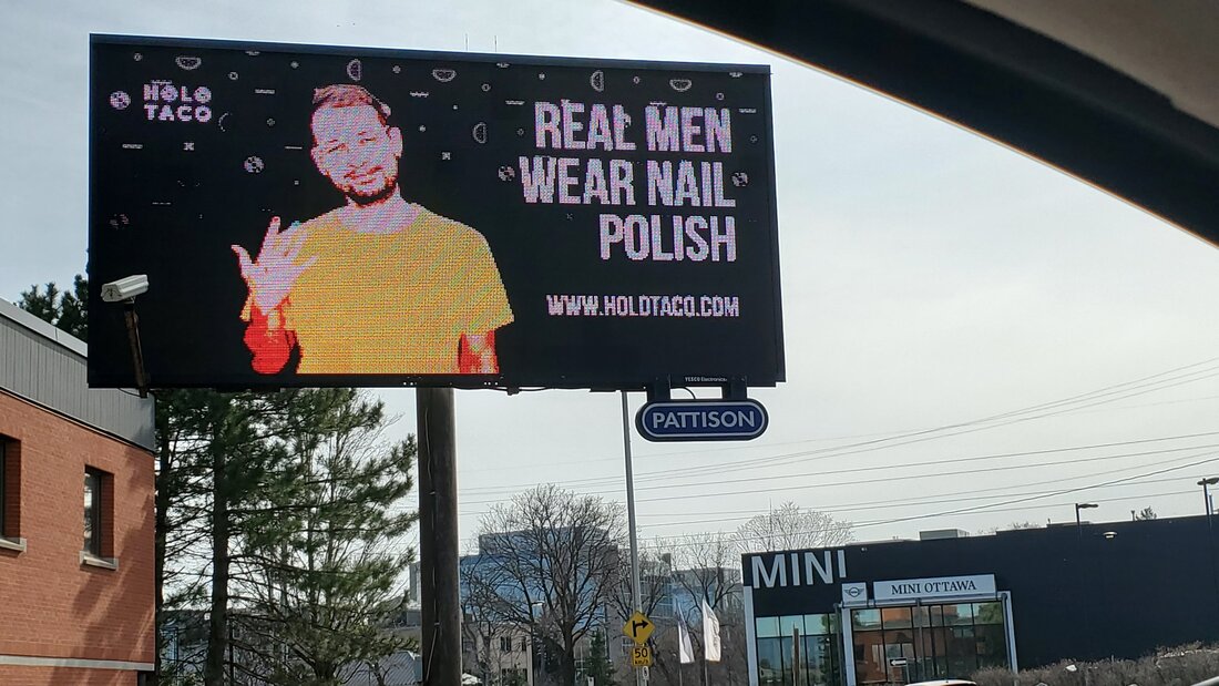
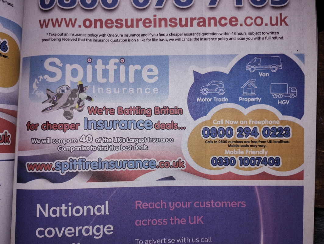
She is a crime statistics analyst with the Canadian government (StatCan). Her partner, Ben Mazowita, features in the advert. Most of her advertising for Holo Taco (the brand) is over social media, but she released three billboards with different messages over her city, Ottawa, the capital city of Canada. The context of who an advert is being targeted towards is hard to monitor when its not a digital ad. Especially more when its a billboard, because its just "everyone whos in the city". Judging from the StatCan website, the split between men and women is even, and the median age is 40 years old. The placement of the billboards is typical, no specific placements to target certain communities. I will be focusing on the top image "boring nails? its not a problem anymore!" Linguistic Message, Denotation: The message is simple, if your nails look boring, it wont be a problem any more after buying the product. They must have fun, new, flashy, exciting colours of polish. The brand name is confusing but intruiging. Connotation: the phrase "its not a problem anymore" is an in-joke for her community, taken from a line in another YouTube channels video where they do awful life hacks with "read at gunpoint" sounding voiceovers, that she routinely uses as a punchline for jokes. This gives people "in the know" so to speak, an extra level of connection with the ad, and many in and around Ottawa went out to take photos will the billboards for this reason. The spacing of the second half of the phrase, with "anymore" being on a lower line alone, copies the style in which she says the phrase, almost singsong-y, with a pause and emphasis on the last word. For her fans and followers, the advert is very clearly a Simply Nailogical ad, without even mentioning anything about her YouTube. The brand name "Holo Taco" is shorthand for "holographic topcoat", holographic being a type of glitter that shines in a rainbow spectrum, and topcoat being a nail polish type. Upon visiting the site this becomes very obvious, as theyre known for their holographic nail polishes. Its hard to tell from the photos but the name logo has two CD emojis where the 'O's are in Holo, as the back of a CD shines with the holographic coating, and was used by the community often. Image Message, Denotation: the man in the image is friendly, but not over excited and false seeming, he looks wholesome, and the bright yellow shirt and rainbow nails gives a feeling of joy and happiness, and wearing a t shirt makes him appear casual. Connotations: Everyone who knows Cristine, knows this is her long suffering partner, Ben. He is known for bringing chaos, joy, and sarcasm to videos, podcasts and streams. He doesnt do nail art himself, but happily allows Cristine to paint his nails. He has become iconic in the community for being associated with bananas (or, Benanas) despite not actually loving bananas. Hence his banana yellow shirt. For those who take time to evaluate the ad for more than a moment, but aren't part of the community, it becomes clear that the brand is forward thinking and inclusive, having a male model for the advert of a nail polish company, showing a dismissal of conservative and out of date gender norms, the background aesthetic (a repeating pattern also seen on the website and some products) is reminiscent of "arcade carpet aesthetic" from the 90s, invoking nostalgia in older gen z and millennials. The use of black and white gives a crisp, clean, modern feeling, while maintaining the charm and energy of childlike fun through the bright zazzy yellow shirt and the nostalgic pattern. The typeface is a medium-heavy weight, with an even stroke weight that is consistent, and being slightly taller than normal. It is also written in all caps, which is only possible because of how unthreatening the typeface is, in a less clinical/simple typeface, it would be too busy and draw too much weight of the full image to the right hand side. The balance of the image is perfect, the logo brings the attention back across to the left, and the off centre positioning of Ben makes it feel less like you're looking about to be assaulted with an overly fake Grammarly ad, and more like a friend showing you something cool they've found. The ad strikes a good balance between an advert that works with generally understood signs through connotation, and a deeper level of signs only known to the community, giving an exclusive feel to the long time fans of Cristine and the brand. The anchorage is distinctly interdependant, the words alone or the image alone wouldn't communicate the full picture, nor would it be as engaging or aesthetically pleasing. I did not mean to write 800 words on one advert, I kind of forgot what I was doing and just kept writing and here we are. MAGAZINEThis is an ad inside a phone book (!!! did not know they still existed, was very confused when it came through my door) sent out by BT to all/most Carlisle and North Cumbria homes in the start of 2023. However, its unlikely a gen z would ever pick up a phone book and look at it, so this ad is likely directed towards older generations. This likely informed the choice for the name and branding, and also the style of the ad.
Linguistic Message, Denotation: an insurance site that covers many things like property and cars, a battle to "fight the man" and get you the payouts you're owed. Connotation: rounded typeface comes across as friendly and trustworthy, like a friendly nan who would never do anything to screw you over. Image Message, Denotation: British wartime pride, here for you, "your country needs you" kind of feeling. It includes a spitfire plane, used by Britain in WW2, synonymous with older generations national pride. Connotation, unthreatening, very patriotic use of colour, the yellow adds a pop that reminds me of a sale bubble sticker, theres a speech indicator coming off the blue bubble but I don't understand whos meant to be speaking.... god? is that you?? The plane is very unthreatening like the typeface, it means they lose out on being able to appear tough and fighting for you, but my guess is they wanted the more wholesome "weve got your back pal!" feeling. Anthropomorphising the plane is an odd choice, especially given its targeted towards adults, it comes across like an advert for a childrens TV show with the cartoon eyes. The anchorage is dual message in the connotations, both the images and the text provide the same deeper associations or protection and strength, but for the denotation I think its interdependent, as the plane alone wouldn't explain insurance as a concept. Its a bit of both. SELF CRIT THIS WEEKDon't miss lectures :') the powerpoints help but its not as good as getting in person notes
|


RELEVANT LINKSNot necessarily relevant to semiotics, but also not irrelevant, and interesting.
2021 Census Results for the City of Ottawa
Population 1,017,449 Median Age 40.0 Pretty even spread between men and women. Being a statistics analyst for a living, Cristine did a live stream looking at the data after spending $5000 CAD on the three billboards.
Just a link to the spitfire wiki page, very cool plane :)
|
5) the graphic code of comic books
SELF CRIT THIS WEEK |
RELEVANT LINKS |
6) Subculture and style
SELF CRIT THIS WEEK |
RELEVANT LINKS |
:)